
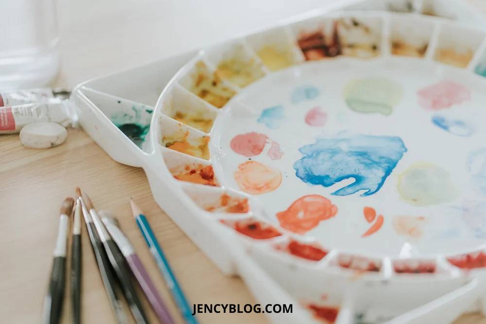
There is a quiet kind of magic that happens on your palette—that exact moment when two colors meet and settle into something entirely new. Mixing colors is one of my favorite parts of painting. It is how you truly begin to understand how pigments behave, how they shift when you add more water, and how they change each other in surprising ways.
Over the years, I have found myself returning to a few specific mixes again and again. Some started as small experiments, while others solved very specific painting problems. Either way, they’ve all earned a permanent spot on my palette.
Today, I’m sharing some of those favorites with you—simple combinations that create beautiful, natural colors. While some of these aren’t in my daily rotation anymore (except for my go-to gray made from French Ultramarine and Burnt Sienna), they were once the heart of my ‘ultimate’ mixing palette, and they are definitely still worth knowing.
I created the following mixes using Winsor & Newton paints. However, you can easily recreate these with any brand you have on hand or experiment to find your own favorite combinations!
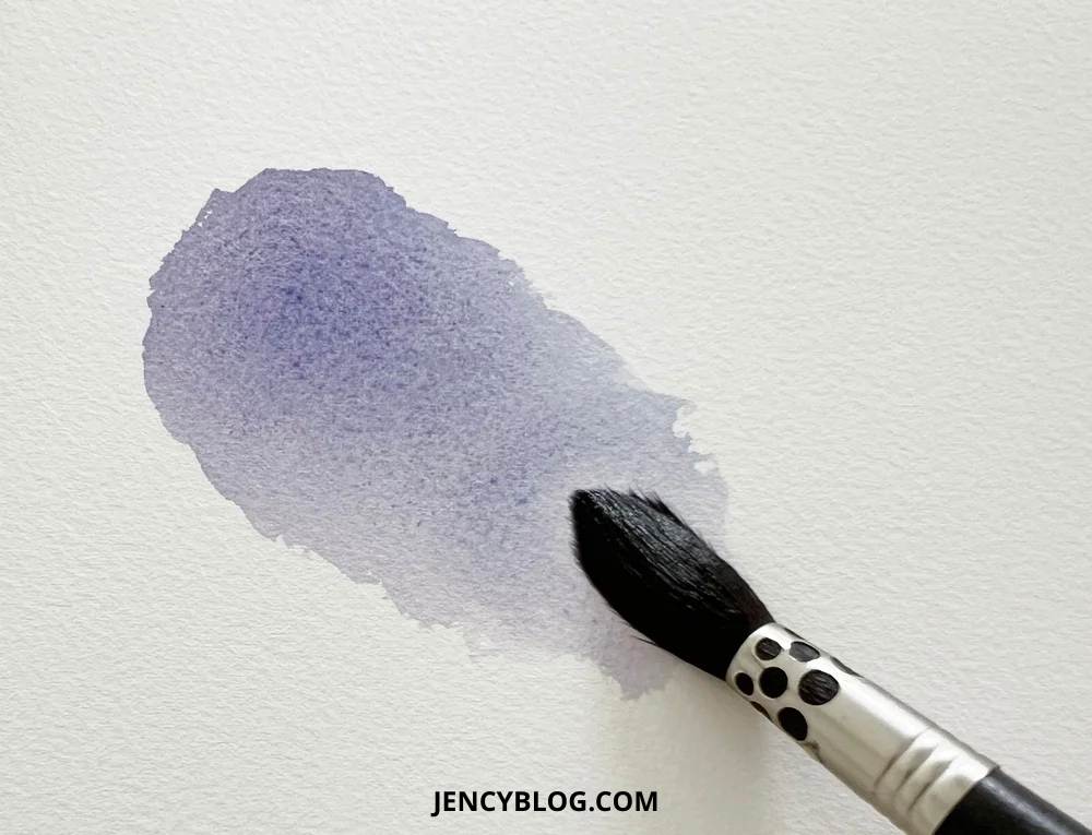
1. Scarlet Lake (PR188) + French Ultramarine (PB29)
A warm violet—perfect for tulip stems.
This unexpected pairing of a warm red and a warm blue creates a violet with a lovely, soft undertone. It’s a very “botanical” color that never looks dull or flat. It works beautifully for “wet-on-wet” painting, where the colors separate just enough to keep the section looking alive.
Why it works: Usually, if you want a vibrant, neon purple, you’d mix a cool red with a warm blue. Because we are using a warm red here, the mix naturally becomes a more muted, earthy violet. That soft, natural quality is exactly why it’s a great choice for stems and shadows!
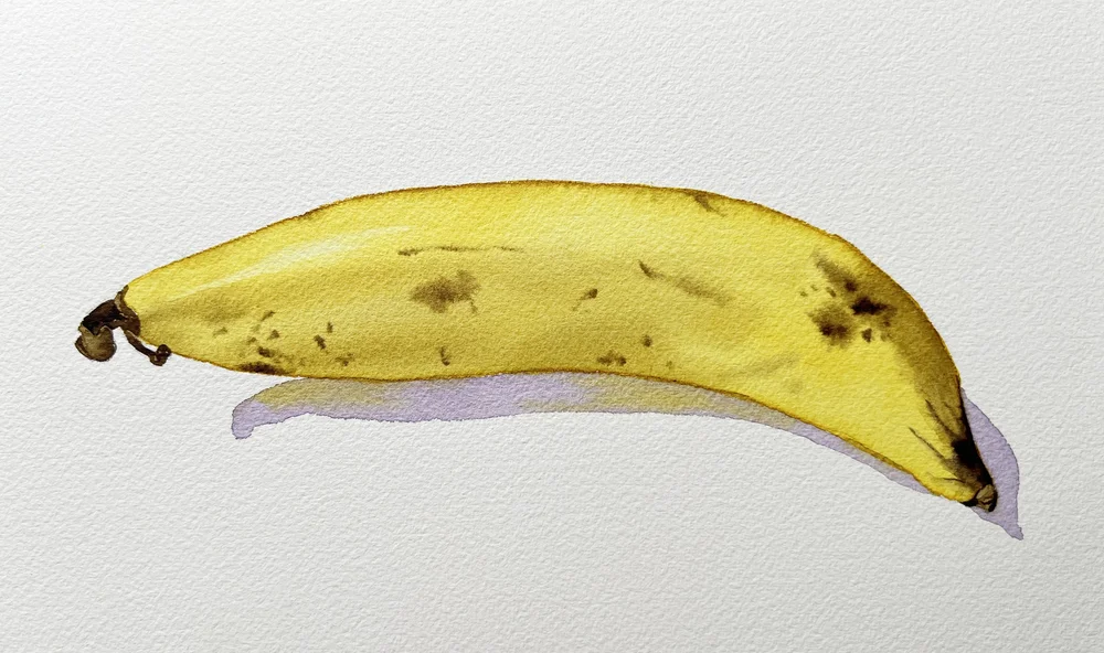
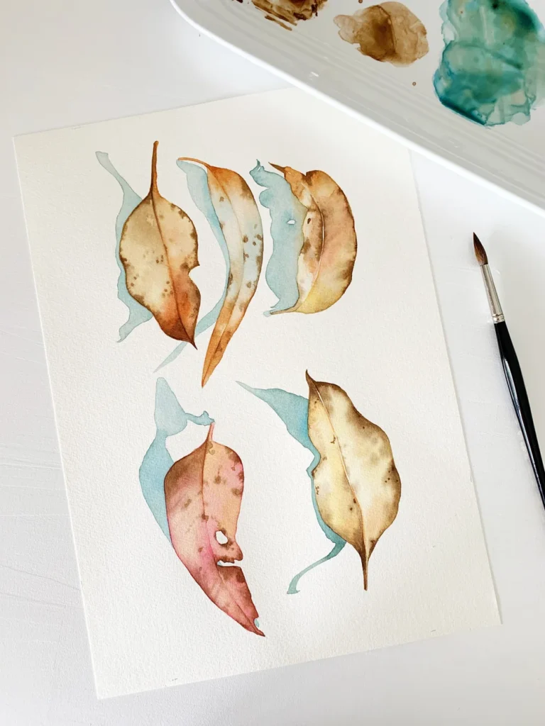
2. Transparent Yellow (PY150) + Winsor Violet (PV23)
From “dirty” yellow to rich brown.
When you combine these two, you unlock an entire earthy spectrum—everything from a muted yellow to olive-toned shadows and warm browns. It’s a very flexible mix that is ideal for multicolored petals, dried leaves, or any area where you need a natural-looking transition from light to shadow.
I even used this exact combination to paint a [banana]—the transition from yellow to those brown spots looked incredibly realistic!
Transparent Yellow mixed with Winsor Violet. You could substitute Daniel Smith’s Nikel Azo Yellow here.
3. Orange
Winsor Yellow (PY154) + Scarlet Lake (PR188) + Winsor Blue Red Shade (PB15) A glowing orange-shadow brown.
An orange mixed from scratch always looks more “alive” than one squeezed from a tube. By adding just a touch of Winsor Blue (Red Shade), you can instantly deepen that orange into a rich, transparent brown. This is a fantastic shadow color for anything with warm tones—think persimmons, apricots, terracotta pots, or even natural skin tones.
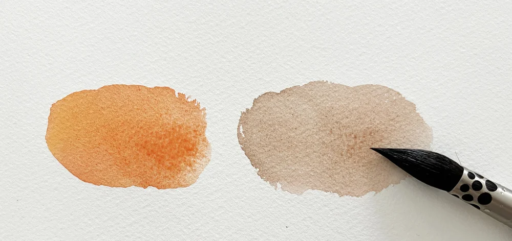
on the left, you have a bright Orange mixed from Winsor Yellow and Scarlet Lake. On the right, I’ve added a tiny bit of Winsor Blue (Red Shade) to show how it transforms into that deep, glowing shadow color.
4. Antwerp Blue (PB27) + Burnt Sienna (PR101)
A teal-blue surprise.
This is one of those happy accidents that quickly became a “must-have” on my palette. Usually, when you mix a blue and a brown, you expect a standard blue-gray. But with this specific pairing, you get a soft, moody teal. It makes painting atmospheric backgrounds feel effortless and adds a touch of drama without looking heavy or muddy. It is absolutely perfect for painting Eucalyptus leaves!
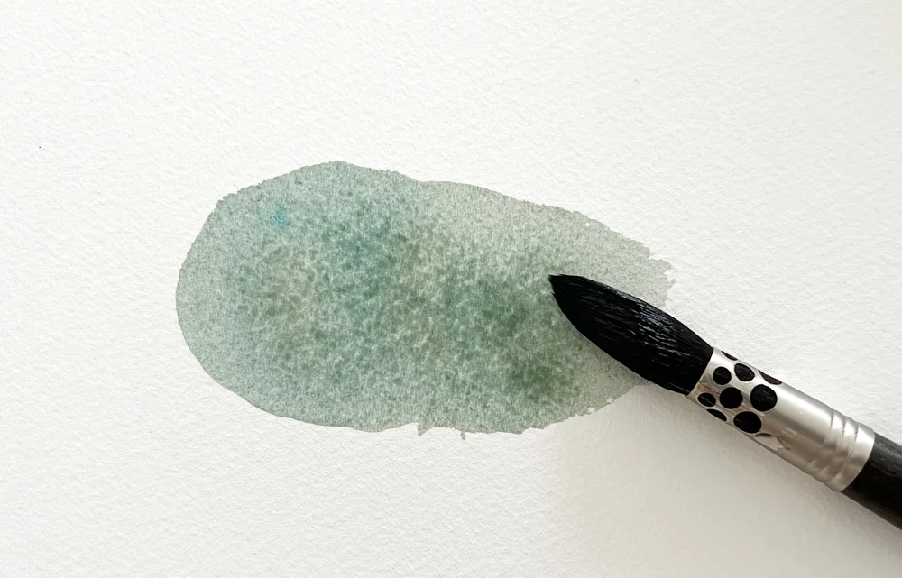
A quick note on the blue: Antwerp Blue uses the same pigment as Prussian Blue, but it’s much milder and lighter. Because it has a lower pigment strength, it isn’t as intense, making it a lot easier to control in your mixes!
I used Antwerp Blue mixed with Burnt Sienna for the shadows of these eucalyptus leaves.
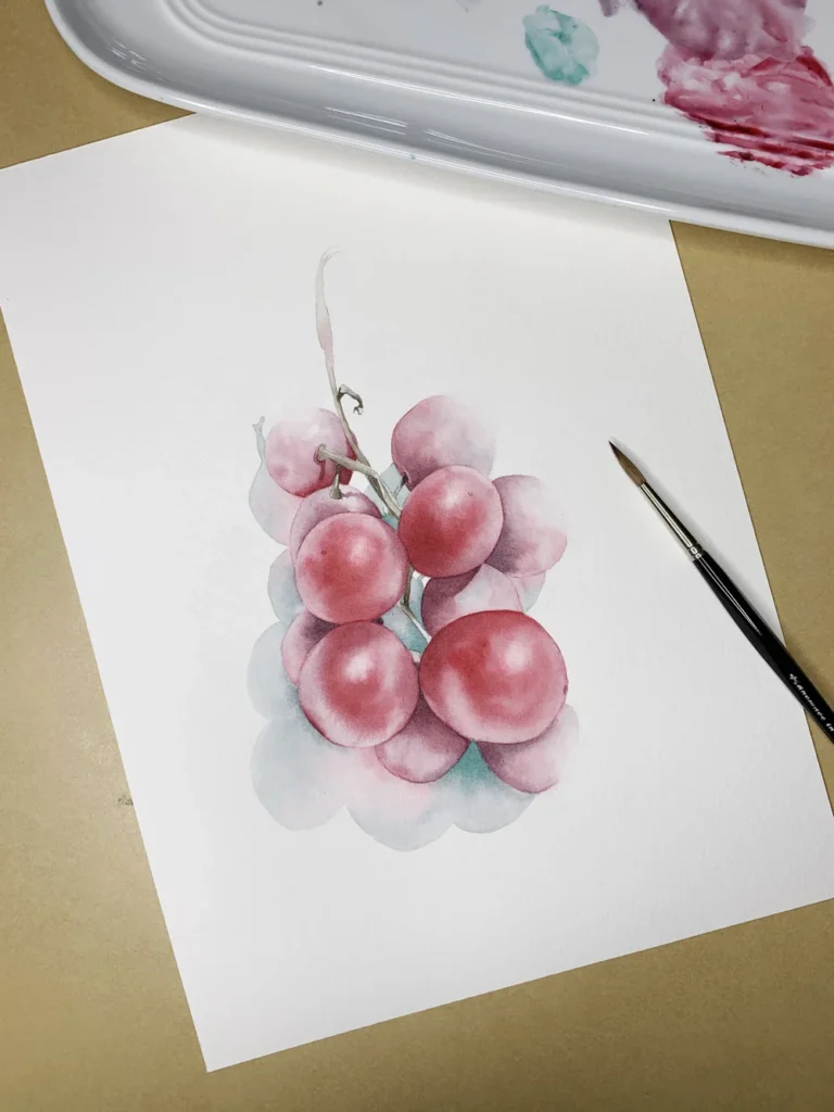
5. Viridian (PG18) + Permanent Alizarin Crimson (PR206)
A dark plum violet—perfect for grapes.
This combination creates a jewel-toned, deep violet that is perfect for painting fruit. Because it has a slightly cool undertone, the color stays “alive” and vibrant even in the darkest shadows. It is my go-to for grapes, plums, dark cherries, or adding a touch of depth to any dark shadow.
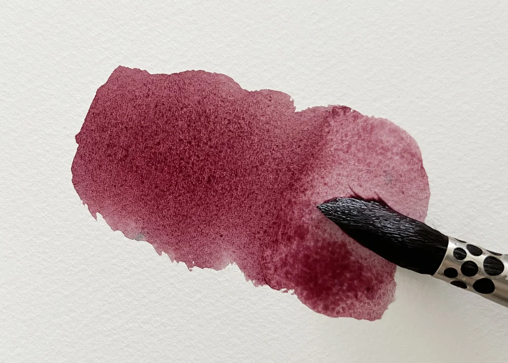
Viridian mixed with Permanent Alizarin Crimson.
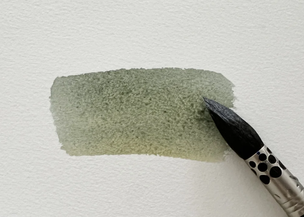
6. Sepia (PBk6, PR101) + Viridian (PG18)
A greenish, grounded brown.
This mix is perfect for painting tree bark, old wood, or the deep shadows tucked between leaves. It gives your painting a natural, earthy “weight” that looks much more realistic than using brown straight from the tube. It’s especially useful when you want a brown that feels “alive” rather than flat and dull. I actually used this specific blend for the stems in my grape painting!
7. French Ultramarine (PB29) + Naples Yellow (PBr24, PW6)
Minty, muted greens.
When you add more Naples Yellow to the mix, the color shifts into a soft, almost vintage-looking green. It’s gentle enough for delicate botanicals and soothing enough for background leaves.
It is a beautiful alternative to using green straight from a tube. Even though Naples Yellow is an opaque paint, it still blends softly in this combination, giving the green a lovely, muted quality. I used this mix to paint a beautiful flannel flower

French Ultramarine mixed with Naples Yellow.
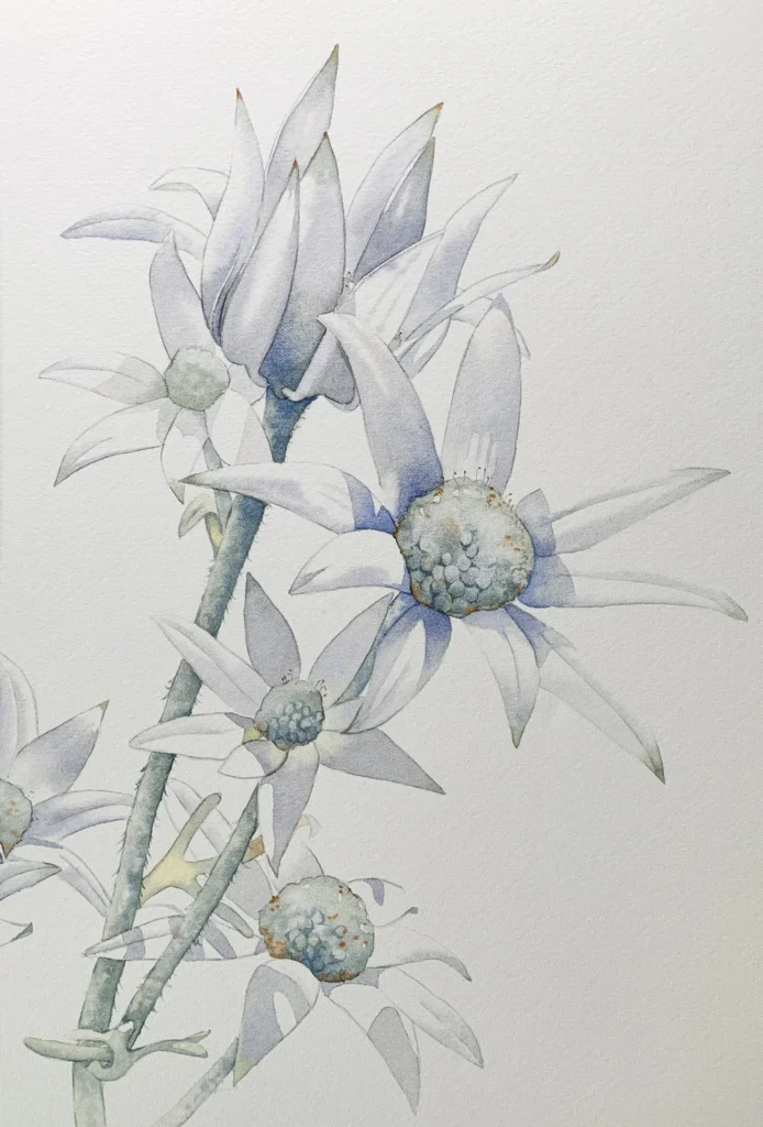
French Ultramarine mixed with Naples Yellow gave me the beautiful minty breen I needed for the centres and stems of these flannel flowers.
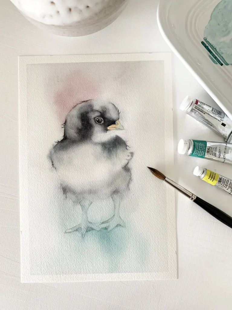
8. Permanent Alizarin Crimson (PR206) + Winsor Green (Blue Shade) (PG7)
A lifelike, vivid black.
This is one of my most reliable ways to make black—it’s rich, deep, and never looks “chalky” or flat. Because both of these are transparent colors, they layer beautifully, which is something premixed blacks in a tube usually can’t do.
Pro Tip: If you add a little water to thin out the mix, you’ll discover a whole family of gorgeous grays hiding inside! This mix is what gave so much life to a [little chicken] I painted recently.
Permanent Alizarin Crimson mixed with Winsor Green blue shade.
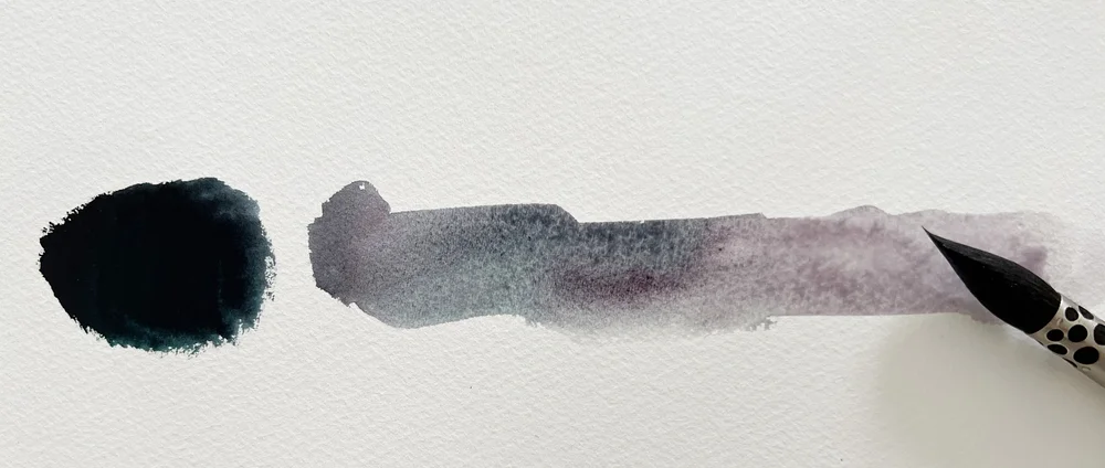
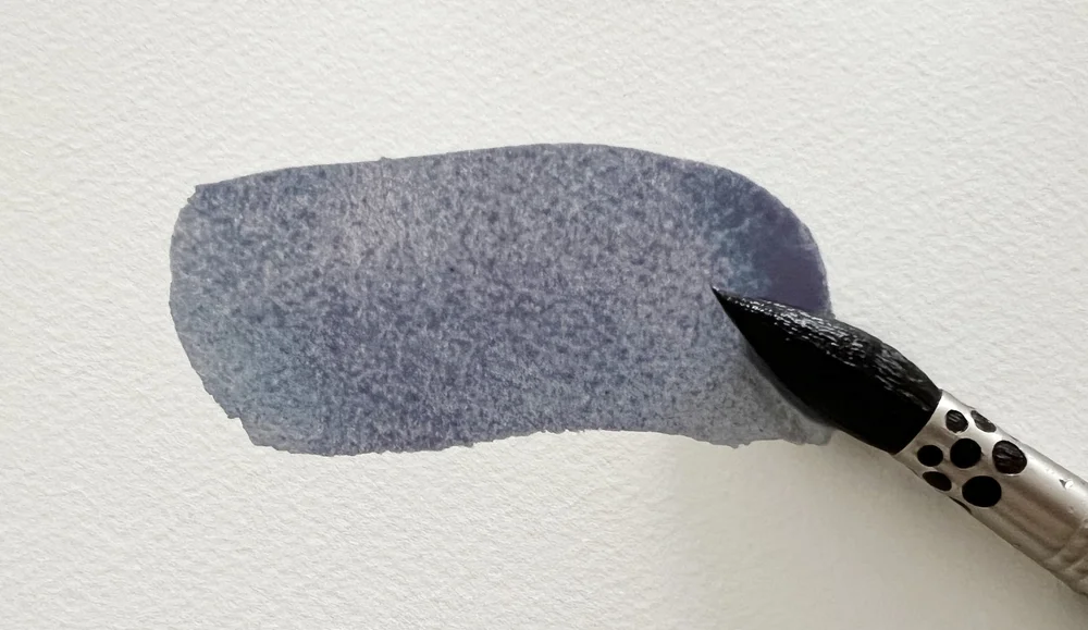
9. French Ultramarine (PB29) + Burnt Sienna (PR101)
Gray to black, with character.
This is an all-time classic for a reason! These are probably the two most-used colors on my palette, both on their own and together. From soft dove grays to warm, deep blacks, this pair can do it all.
Why I love it:
Texture: French Ultramarine granulates beautifully (meaning the pigment settles into the “valleys” of the paper), making it perfect for painting feathers, stone, or soft shadows.
Versatility: If you mix the paint thick, straight from the tube, you get a rich, dark black.
French Ultramarine mixed with Burnt Sienna.
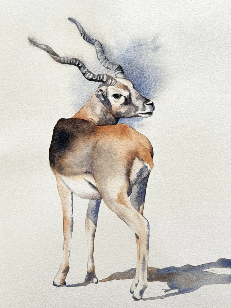
This Blackbuck was painted with just two colours: French Ultramarine and Burnt Sienna.
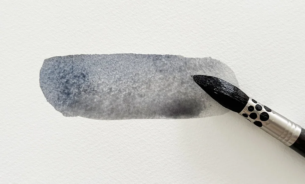
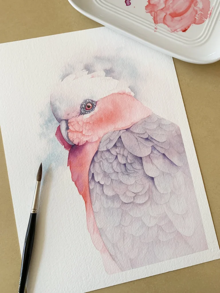
10. Quinacridone Red (PR209) + Cobalt Turquoise Light (PG50)
A delicate, soft gray.
These two create a gentle, ethereal gray that works beautifully for backgrounds or the softest shadow transitions. It’s one of those colors that seems to “quiet” the whole painting, giving it a calm and peaceful feel. I used this specific mix to paint a lovely Galah (a pink and gray cockatoo).
Quinacridone Red mixed with Cobalt Turquoise Light.
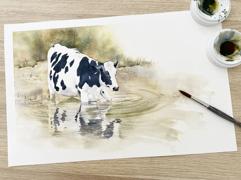
11. Indian Yellow (PO62, PY139) + French Ultramarine (PB29)
An earthy, muted green.
Because both of these pigments are warm, they create a green that feels sun-touched and grounded. I reach for this mix whenever I’m painting leaves that need to blend harmoniously into the rest of the scene. It’s a very natural, “outdoor” green. You can see how it looks in this painting of cows!
Indian Yellow mixed with French Ultramarine
A Little Advice on Mixing Your Colors
Over the years, I’ve learned a few simple lessons that have completely changed the way I mix paint. While understanding color theory is a huge help, these ‘rules of thumb’ are what I keep in mind every time I pick up my brush:
‘Let the paint do the work.’ Sometimes you need to step back and let the water move the pigment around. The results are often much more elegant than anything you could create by over-mixing.
‘Don’t look for the “perfect” color in a tube—mix it.’ Think of tube colors as your ingredients, not the final meal. Your most expressive and unique shades will almost always come from the combinations you create yourself.
‘If your painting feels messy, you’re probably using too many colors.’ Using fewer colors helps everything in your painting feel like it belongs to the same story. A limited palette brings a sense of calm and clarity to your work.
‘Treat your paints like old friends.’ The more you know about them—like if they are warm or cool, see-through or grainy—the more confident you’ll feel trying new things with them.
‘Great mixes come from curiosity.’ Every time two colors touch, you learn something new. Give yourself permission to experiment and play. That curiosity is the heart of being an artist!
Why Mixing Your Own Watercolors Matters
If you’ve ever felt like your paintings look a bit “busy”—with colors fighting each other rather than working together—the solution is simpler than you think: mix more of your own colors.
Many artists start out with a huge variety of tubes because it seems easy. But over time, those ready-made colors can actually work against you. They might look pretty on their own, but when you put them side-by-side, they don’t always create that soft, natural harmony that makes watercolor so special.
When you use a limited palette and mix your own shades, everything changes. It forces you to paint with more intention. Every wash and every shadow suddenly carries the same “DNA,” which is where true balance begins.
What happens when you embrace your own mixes:
Your paintings feel more unified: Because your colors share the same base pigments, the whole piece has a natural, internal harmony.
You get total control: Instead of just accepting the color from the tube, you decide exactly how warm, cool, or transparent your paint should be.
Your shades look organic, not “fake”: Mixed colors have a “lived-in” quality that is perfect for petals, feathers, and skin tones.
You truly learn your tools: The more you mix, the more you understand how each pigment behaves—whether it grains, blossoms, or settles.
Your process becomes calmer: With fewer colors to choose from, you can stop worrying about the clutter on your palette and focus on the art itself.
In the end, you don’t need a massive collection of paint to create glowing, expressive work. Just a few pigments can open up hundreds of possibilities. As you get more comfortable, mixing becomes like your own personal language—intuitive, consistent, and uniquely yours.
Mixing your own colors isn’t just a technique; it’s a mindset that brings clarity and harmony to everything you create.
Why a Limited Palette Makes Everything Easier
Working with fewer colors doesn’t limit you—it actually sets you free! It encourages you to truly understand your pigments, creates more harmonious paintings, and makes the whole process much less overwhelming. When every color in your piece comes from the same small ‘family,’ the painting feels naturally unified.
With just a handful of thoughtful pigments, you can create an astonishing range of shades—from the softest grays to the richest blacks, and from natural greens to glowing violets. The magic isn’t in having more paint; it’s in knowing your colors intimately and trusting what they can do together.
Your Watercolor Palette Is a Story You Build Over Time
Beautiful color mixes don’t happen by accident. They are discovered through experimentation, curiosity, and a willingness to learn from every pigment. By understanding how a small set of colors behaves, you gain more than just skill—you gain confidence.
These unique color mixes are a wonderful place to start, especially if you want to develop a style that feels natural, expressive, and beautifully cohesive. Grab a piece of scrap paper and just watch the magic of watercolor happen!
Wherever you are on your painting journey, I hope these mixes bring a little more curiosity and joy to your palette. Let them be starting points rather than rules. Above all, enjoy the quiet magic of watching your colors come to life.
So, grab your brushes, your paints, and your color wheels, and get mixing! I can’t wait to see your swatches and the unique combinations you create.
Happy painting,
Jennifer