
Painting on Aquabord is a completely different experience compared to traditional watercolor paper. Because the surface is clay-coated, it allows colors to stay incredibly vibrant and lift away with ease. This makes it the perfect choice for lively, high-contrast subjects—like this little tree frog!
In this post, I’m going to share a few of my favorite tips for working on this unique surface and take you through the exact steps I used to bring this little guy to life.
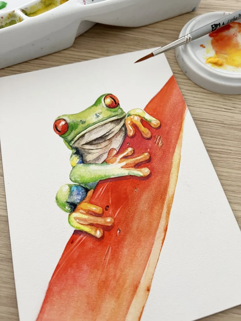
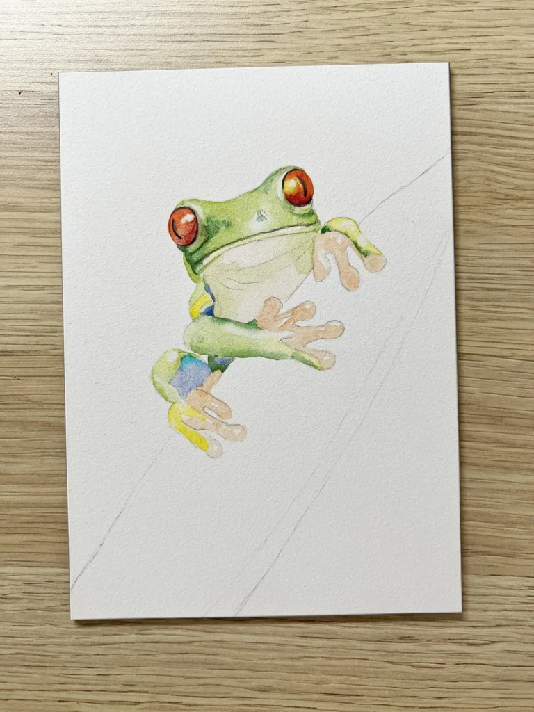
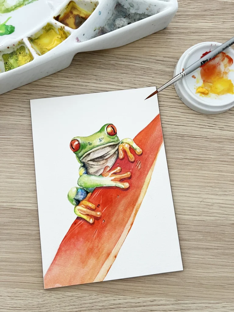
A watercolour painting of a little frog on an Ampersand Aquabord 5 by 7 ” panel. Thanks to Zdenek Machacek for the reference photo from Unsplash.
Watercolor Boards: What is Aquabord?
Aquabord is an acid-free clay panel created by Ampersand Art Supply. It features a highly absorbent surface designed to handle watercolor beautifully, with a texture very similar to cold-pressed paper.
There are two reasons I specifically love Aquabord: first, colors can be lifted away easily, making it simple to create bright highlights or fix mistakes. Second, once your painting is finished and sealed, it doesn’t need to be framed behind glass! This allows the texture of your work to really shine.
The Materials I Used
Surface: Ampersand 5″ x 7″ Aquabord panel
Schmincke Watercolors: Phthalo Blue, Transparent Yellow, French Ultramarine, Transparent Sienna, Scarlet Red, Madder Red Dark, and Payne’s Gray Bluish.
Watercolor Pencils: Faber-Castell Albrecht Dürer (Mauve) and Derwent Inktense (Black).
Brushes: * Lithe Synthetic Round (#2)
Silver Black Velvet Round (#4)
Da Vinci Micro Nova (#5/0) and Liner (#0)
Da Vinci Nova Filbert (#2)
Rosemary & Co. Eradicator brush (Small)
Transfer: Saral Transfer Paper (Black)
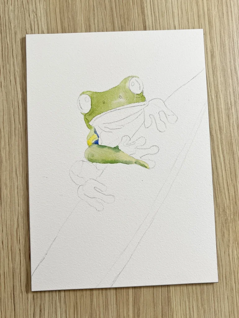
Preparing the Surface
Before you start painting on an Aquabord panel, it’s important to wet the surface with clean water to release any trapped air bubbles. I use a large flat brush to apply a layer of water, then let it dry naturally. Once dry, I transferred my line drawing onto the panel using Saral transfer paper.
The line drawing has been transferred to the Aquabord panel using some saral transfer paper.
💡 Pro Tip: The clay surface is delicate and can be easily damaged by a standard eraser. Instead of rubbing, I gently dab unwanted marks with a kneadable eraser. A sticky lint roller (the kind for pet hair!) also works beautifully for picking up transfer paper residue. If you have a stubborn line on the dry board, you can also use a slightly dampened eradicator brush to gently lift it away.
Laying in the First Washes
Step 1: Establishing the Foundation
I began by mixing a vibrant green using Phthalo Blue and Transparent Yellow, applying it to the head and arm with my Silver Black Velvet brush.
The Pre-Wetting Technique: It helps to lightly wet the board first, but only in the specific areas where you want the paint to settle. Because Aquabord is more absorbent and dries faster than traditional cotton paper, this “wet-on-wet” approach gives you a few extra seconds to blend your colors smoothly.
Keep the Paint Moving: I make sure to keep the “bead” (the pool of wet paint) moving as I work. If it sits still and dries too quickly, it can form a hard edge, making the wash look uneven.
Immediate Highlights: While the paint was still damp, I used a clean, thirsty brush to lift a tiny highlight on the head near the nostril.
Next, I tackled the side section of the frog on dry Aquabord using that same green mix, occasionally dropping in a touch of French Ultramarine and Transparent Yellow for variety. For the arm, I went back to the pre-wetting method. To create depth, I added a bit more Phthalo Blue to my mix and brushed it along the edges while the lighter green was still wet, allowing the two colors to bloom together naturally.
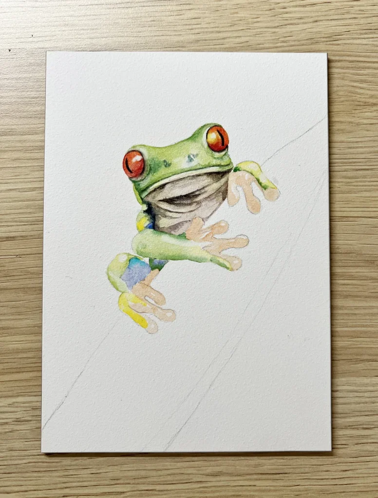
Step 2: Building Color and the Eyes
In this step, I focused on the smaller details of the limbs and the soft underside, using the “wet-in-wet” technique to create smooth transitions.
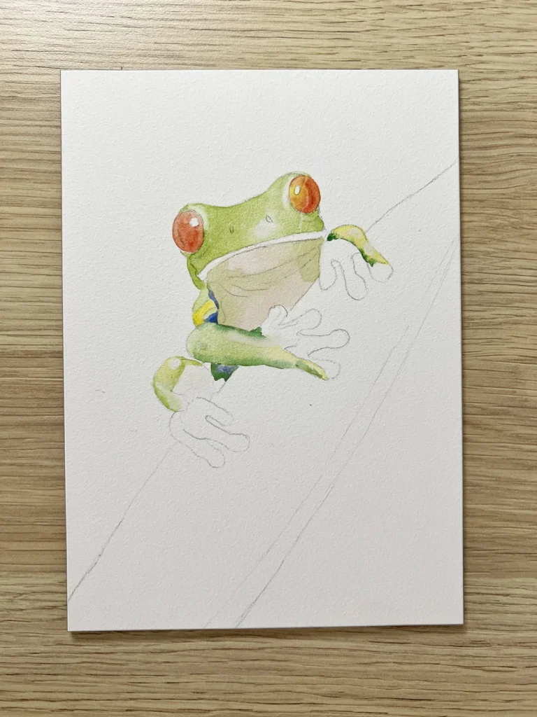
Limbs and Toes: I painted the toe on the right foot with Transparent Yellow. While it was still wet, I used a liner brush to drop a darker green along the left edge. I used this same approach for the left knee—laying down the yellow first and then blending in a lighter green so the colors merged seamlessly.
The Underside: For the belly, I wet the board first and applied a very pale wash of Transparent Sienna. While that was still damp, I touched in a little of my initial green mix to suggest reflected light and shadows.
Refining Highlights: Once the layers were completely dry, I used my filbert brush to lift highlights in a few key spots. The stiff bristles of the filbert are perfect for gently “scrubbing” the clay surface to reveal the white underneath.
The Eyes: I painted the eyes on the dry board using a warm, bright mix of Scarlet Red and Transparent Yellow. Working on a dry surface gave me the control needed to keep the eye shape crisp.
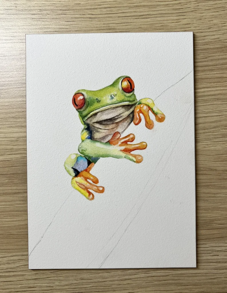
Step 3: Refining with Vibrant Accents
Next, I turned my attention to the limbs and the face, using both wet and dry techniques to layer these bright details.
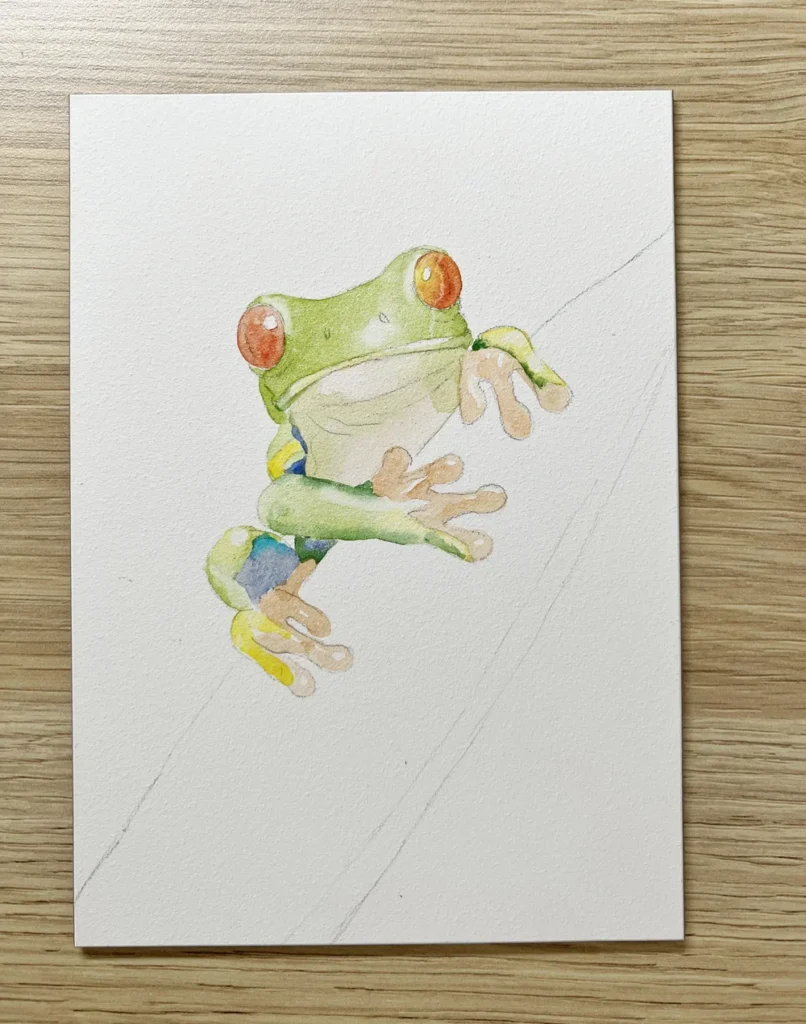
Coordinating the Toes: I thinned the orange mixture from the eyes with a bit of water and brushed it onto the toes on the dry board. Working on a dry surface allowed me to navigate around the highlights easily, leaving them bright and untouched. For the toe on the lower left foot, I added a quick touch of Transparent Yellow to the dry board for extra glow.
Adding the Blue Highlights: I painted the blue patch on the knee using French Ultramarine. While that was still wet, I dropped in a small patch of Phthalo Blue to create a more vibrant, multi-tonal effect before it had a chance to dry.
Warming the Face: To give the face a bit more character and warmth, I brushed a tiny amount of Transparent Yellow along the front edge of the mouth. This small detail helps define the anatomy while keeping the colors feeling fresh.
Building Up the Detail
Step 4: Adding Depth and Character
Now that the base colors are set, it’s time to build up the forms and define the features.
Defining the Head: I began adding darker green shadows to the head using my original green mix, deepened with a little extra Phthalo Blue. I worked mostly on the dry board, dabbing the brush lightly to create texture and then immediately softening the edges with a clean, damp brush to ensure a smooth transition.
Deepening the Eyes: I applied a second layer of the orange mixture to the eyes to make them more vibrant, adding a touch of Transparent Yellow specifically to the right eye to suggest a highlight from the sun.
The Pupils and Accents: For the darkest parts of the eyes—the pupils and the surrounding areas—I used a Derwent black watercolor pencil on the dry board. This gave me perfect precision. I then “activated” the pigment by gently touching it with a damp Micro Da Vinci liner brush. Finally, I added a few rich accents to the eyes using Madder Red Dark on the dry surface to give them a truly realistic depth.
Step 5: Final Shadows and Definition
In this final stage of painting, I focused on “grounding” the frog by adding depth and weight through deep shadows.
Mixing the Neutrals: I mixed a rich, dark brown using French Ultramarine and Transparent Sienna. Working on the dry board, I painted the shadowed areas on the underside of the frog. Using this mix instead of a pre-mixed black makes the shadows feel much more organic and alive.
Defining the Mouth: I added a subtle touch of darker green along the top of the mouth, again on the dry surface, to give the face more structure and expression.
The Shoulder Shadow: To finish the body, I lightly wet the shoulder area on the left side and brushed in a cool, deep shadow using Payne’s Gray Bluish. The wet-on-wet application here allowed the shadow to soften naturally into the green of the body, giving the frog a three-dimensional feel.
Step 6: Enriching the Colors and Final Touches
This final pass is all about saturation and making those tiny, vibrant details pop against the more muted shadows.
Detailing the Toes: I returned to the orange areas on the toes to give them more punch. Using a small Da Vinci Micro brush, I deepened my orange mixture with extra pigment and painted the darker sections directly onto the dry board. To really make the color “sing,” I also used Scarlet Red on its own to enrich the warmest spots.
The Knee and Accents: I painted the deep, dark patches on the knee using Payne’s Gray Bluish on the dry surface. Working dry here ensured that these markings stayed crisp and didn’t bleed into the surrounding blue.
Warming the Shadows: To finish the belly, I brushed a small amount of Transparent Sienna onto the underside of the frog. Applying this to the dry surface over the previous washes added a lovely earthy warmth to the reflected light in the shadows.
Step 7: Painting the Flower and Grounding the Subject
To complete the piece, I turned my attention to the flower. Using the same pigments from the eyes creates a wonderful sense of color harmony throughout the painting.
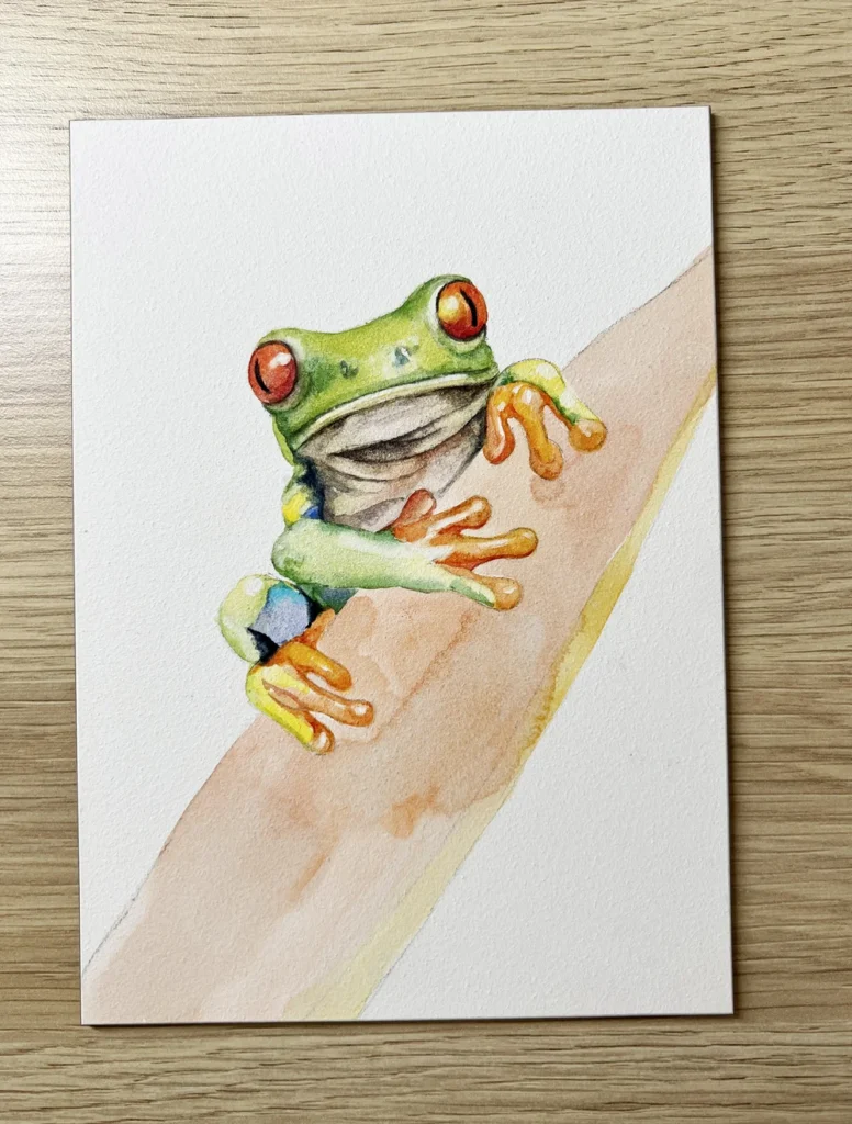
The Base Wash: I washed in the petals using my Scarlet Red and Transparent Yellow mix. For the front edge, I leaned more heavily on the Transparent Yellow with just a hint of red to keep that area bright and forward-facing.
Building Depth: I layered the orange mixture several times until I was happy with the richness. I kept the color deepest right where the frog sits and gradually lightened the wash by adding more water to my brush as I moved toward the outer edges.
Texture and Highlights: Once the flower was completely dry, I used a damp eradicator brush to lift subtle markings out of the clay. I then used my Micro brush to apply the dark brown mixture over those highlighted spots for added detail. To finish the petals, I re-wet the front edge and ran a bit of dark orange through it to create a soft, blended transition.
Final Shadows: To make the frog truly look like it has “weight,” I added soft shadows where the toes rest on the flower using a Mauve watercolor pencil. Instead of drawing directly on the board, I lifted the pigment directly from the pencil tip with a damp Silver Black Velvet brush and applied it gently. This created a soft, realistic shadow that anchors the frog to the flower.
Final Thoughts
Working on Ampersand Aquabord is a unique experience that truly changes how you approach watercolor. It allows your pigments to retain their maximum vibrancy while making it incredibly easy to lift or adjust your colors as you work. This texture provides the perfect foundation for creating rich, luminous paintings that really stand out.
One of the best parts is the finished result: once your painting is complete, you can seal it with an archival spray varnish and frame it without glass. This keeps the artwork fully protected while allowing its natural beauty and texture to be seen clearly by everyone.