
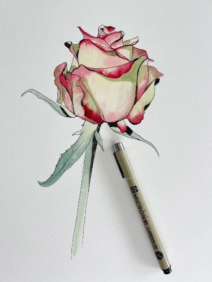
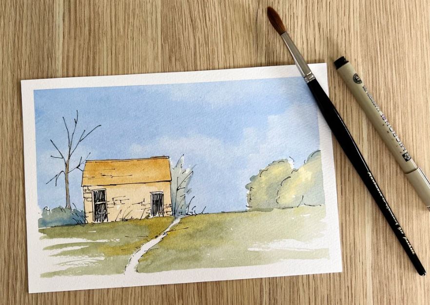
If you’ve ever been drawn to art that marries intricate detail with fluid color, you’ve witnessed the magic of Line and Wash. Whether you call it ink and watercolor or illustrative wash, this technique is a beautiful fusion of defined ink lines and soft watercolor washes.
It’s a versatile approach, perfect for everything from delicate nature studies to vibrant cityscapes. By balancing structural control with creative spontaneity, it offers a rewarding experience for beginners and pros alike. In this post, I’ll share my essential tips, the tools I rely on, and how to find that perfect “sweet spot” between bold ink and delicate color.
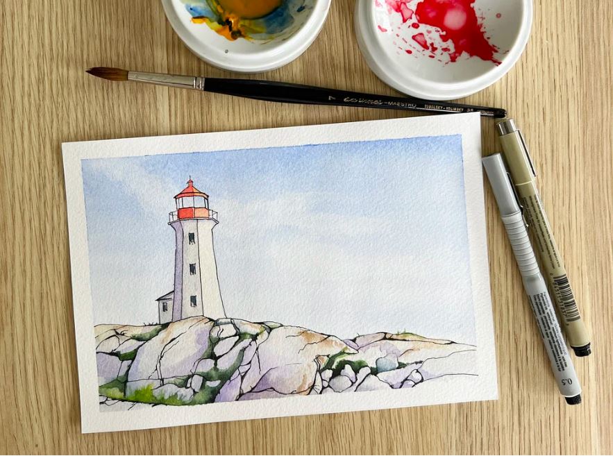
A small lighthouse illustration made with ink and watercolor paint.
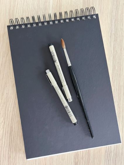
The Tools: Elevating Your Artistry
The right tools are essential to balancing the structure of ink with the fluidity of watercolor. Here is what I recommend:
1. Choosing Your Pen
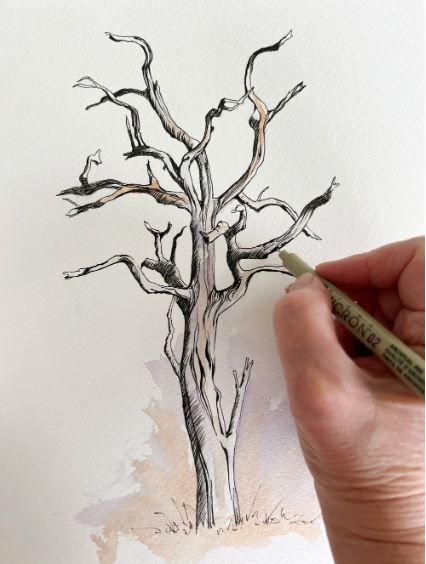
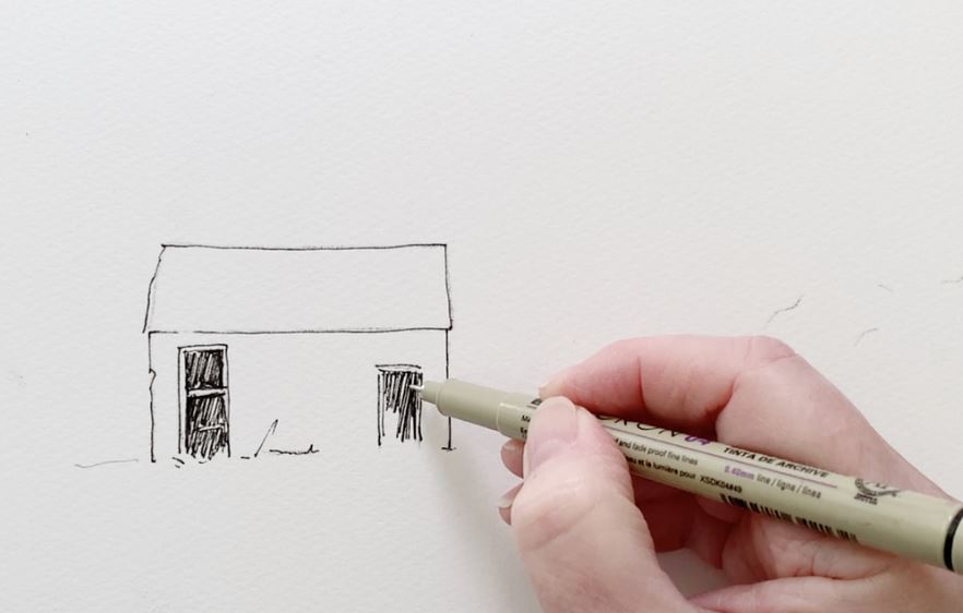
In this technique, ink is more than an outline—it’s the “bones” of your painting. I always use waterproof ink to ensure lines stay crisp when layered with wet paint.
Fine nibs (0.1–0.3 mm): Perfect for intricate details.
Broader nibs or brush pens (0.5 mm+): Ideal for bold focal points.
Favorites: I personally rely on Pigma Micron pens for their archival, waterproof quality. That said, some artists (like my friend Paul) even use a garden stick dipped in ink! Use whatever brings your vision to life.
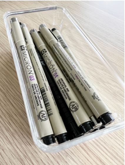
I draw my ink lines with Pigma Micron waterproof black ink pens.
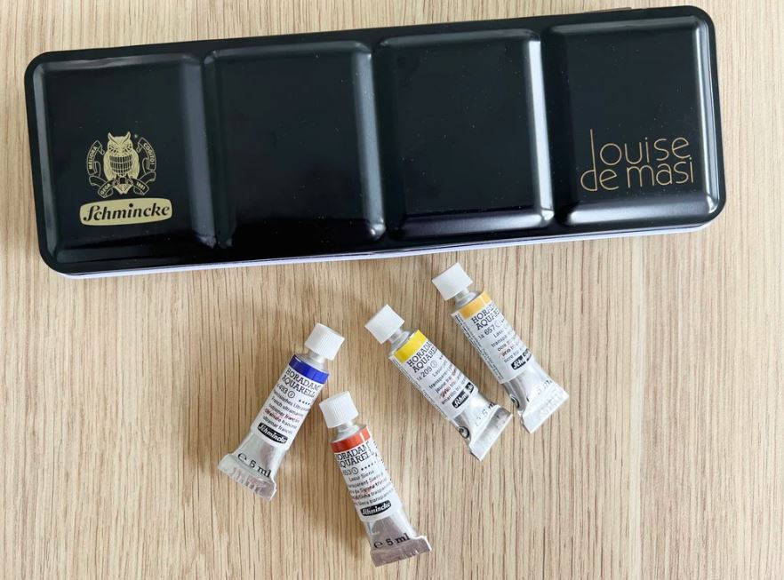
2. Watercolor Selection
Watercolor’s transparency is what makes this duo work. I prefer transparent pigments that allow the ink work to remain visible rather than masking it.
Tip for Beginners: Start with a limited palette (3–5 colors). This creates a harmonious look and prevents the paint from overwhelming your line work.
Selecting the Perfect Surface
While line and wash is incredibly versatile, your choice of paper is the foundation that allows both ink and color to truly sing. In my experience, starting with a clean white surface is essential; it ensures the transparency of your watercolors remains vibrant rather than becoming muddy.
Cold press watercolour paper.
For most projects, cold-pressed watercolor paper is my go-to choice. Its subtle texture, or “tooth,” catches the pigment beautifully while providing a stable surface for ink. If you prefer a more graphic look, hot-pressed paper offers a silky-smooth finish that is perfect for ultra-sharp, precise lines, though you’ll need to work a bit faster when blending your washes.
Hot pressed watercolour paper is smooth – prefect for crisp ink lines.
If you enjoy traveling or urban sketching, a dedicated watercolor sketchbook is a fantastic companion. These are designed to handle light washes on the go without the frustration of the paper buckling. For those who like to experiment with colored pencils alongside their ink, mixed media paper provides a smoother alternative, though it’s best kept for lighter washes to avoid warping. Finally, for a professional, polished piece, illustration boards offer a sturdy, rigid base that stays perfectly flat no matter how much water you apply.
Ultimately, while I find cold-pressed paper hits the mark for most projects, don’t be afraid to experiment. Each surface has its own personality, and discovering how your pen glides across different textures is all part of the creative joy.
Tip 1: Start with a Light Pencil Sketch
For many, the blank page can be intimidating, especially when holding a permanent ink pen. Starting with a light pencil sketch is a game-changer, offering a low-pressure way to explore composition and map out your subject before committing to ink. I find this “blueprint” particularly helpful for complex floral arrangements or detailed urban scenes where getting the proportions right is key to a relaxed process.
Once your pencil guide is in place, you can confidently layer your ink, following the lines that work best or even simplifying shapes for a more organic, painterly feel. Remember, the sketch is just a suggestion—not a set of tracks you must stay on. Feel free to let your pen wander and stay loose; using the pencil lines as a safety net allows your final ink drawing to be much more expressive and free.
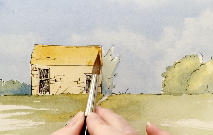
Tip 2: Balance the Ink and Let the Color Breathe
The true magic of this technique lies in the partnership between ink and watercolor; neither should compete for the spotlight. Once your line work is finished, resist the urge to fill in every single gap like a “paint-by-numbers” exercise. Instead, leave some areas lighter or entirely untouched to give the piece an airy, harmonious feel. Remember that your ink drawing is just a soulful guide—if your paint spills over the lines, it only adds to the rugged, spontaneous charm that makes this style so beloved.
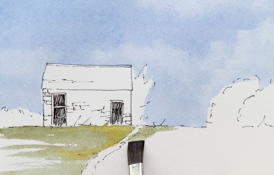
To bring more depth to your work, try varying the weight of your ink lines to create a visual rhythm. Delicate, thin lines are perfect for receding background elements or fragile details, while bolder strokes can pull the viewer’s eye toward your focal point. This contrast in line thickness creates a beautiful structural balance that perfectly complements the soft, unpredictable flow of your watercolor washes.
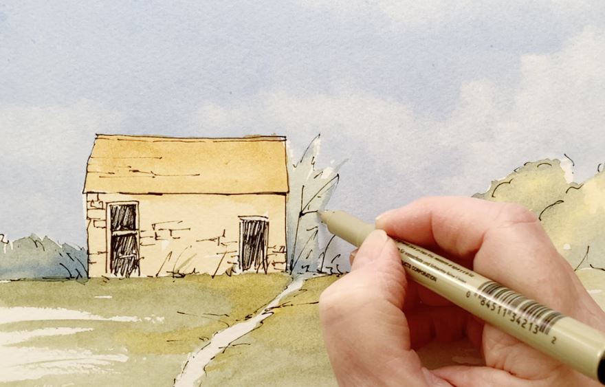
Tip 3: Play with Color Harmony and Layering
A common pitfall for beginners is using an overwhelming array of colors that smothers the delicate ink work. I’ve found that sticking to a limited palette not only creates a more cohesive mood but also allows your outlines to breathe. I typically start with a light, watery wash to establish the atmosphere, gradually building up layers to add depth and dimension.
As you layer, consider how the pigment interacts with your linework to enhance the overall piece. Transparent, light washes are perfect for gliding over intricate details, while bolder, more saturated colors can be saved for simpler areas to create impact. This approach ensures your watercolor supports the ink, breathing life into the drawing without ever obscuring the beautiful lines beneath.
Tip 4: Let the Wash Do the Work
One of the greatest joys of this technique is that you don’t need to fuss over every tiny detail with your brush. Since your ink already provides the structural “heavy lifting,” you can afford to let your watercolor washes stay loose and free. This spontaneous approach is particularly effective for subjects like foliage, water, or skies, where a touch of abstraction breathes natural movement and life into the composition.
In my own paintings, I love letting colors blend naturally on the paper, especially in the background. This lack of over-processing often results in beautiful, organic textures that you simply couldn’t achieve by controlling every single stroke. Embrace those “happy accidents”—they are often where the true magic of watercolor happens!
Tip 5: Embrace Imperfections and Capture Charm
There is a unique allure in the slightly irregular, less-structured nature of line and wash. In fact, a piece often becomes more appealing when it moves away from architectural perfection. Instead of worrying about perfectly straight lines or exact proportions, try to focus on capturing the overall feeling and soul of your subject.
Wobbly lines, stray washes, and those little “mistakes” are actually what give your work its character. These imperfections make a painting feel alive and spontaneous, offering a sense of story that rigid, precise work often lacks. At its heart, line and wash is an invitation to capture the essence of a moment, not its perfection.
Tip 6: Experiment with Different Subjects
For those just starting out, beginning with simple subjects like florals, landscapes, or everyday objects is a great way to build confidence. These forgiving themes naturally lend themselves to the relaxed, sketchy feel of line and wash, allowing you to fully explore the flexibility of the medium.
As you branch out, you’ll begin to discover which subjects truly resonate with your creative spirit. In this style, artists often gravitate toward scenes that highlight the beautiful contrast between intricate, detailed linework and the soft, ethereal flow of watercolor washes.
Urban Landscapes and Architecture
Cityscapes are a natural fit for this technique, as strong pen lines can beautifully define the intricate details of streets, buildings, and landmarks. Once the structure is set, watercolor washes step in to provide atmosphere—whether it’s the warm glow of sunlight, the depth of long shadows, or the moody reflection of a rainy afternoon. Many urban sketchers favor line and wash because it’s the perfect medium for quickly capturing the raw energy and unique character of a scene on location.
Nature Studies and Beyond
Nature is another perfect match for this technique. Here, the pen captures the delicate veins of a petal or the rugged texture of a branch, while watercolor washes suggest the lushness of greenery and the shifting moods of the sky. Whether you are working on a detailed botanical study or a quick nature journal entry, this method beautifully blends precision with softness.
I personally find immense joy in using line and wash for expansive landscapes and scenic artworks.
Everyday Objects and Portraits
Household items, simple foods, and basic shapes offer excellent practice for mastering this medium. Objects like a ceramic cup, a glass bottle, or fresh fruits and vegetables are remarkably forgiving, allowing you to experiment with various forms and textures. While the ink provides a clear structure, the washes infuse these simple scenes with warmth and vibrant color.
Although less common, portraits and figures also translate beautifully into line and wash. You can define facial features with fine ink lines and then use soft washes to suggest skin tones and clothing. This approach creates a sketchy, expressive effect that is perfect for informal or stylized portraits, capturing the essence of a person with a sense of artistic flair.
Image by StockSnap from Pixabay
Animals and the Spirit of Exploration
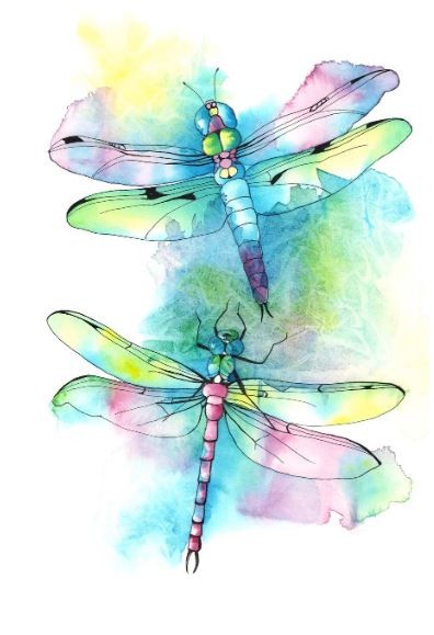
When it comes to animals, line and wash is an exceptional way to capture unique textures like fur, feathers, or scales. You can use the ink to define the sharp detail of an eye or the fine point of a whisker, while allowing soft washes to provide the natural color and softness of a coat. I’ve explored this balance myself with dragonflies in a previous tutorial, which you can find [here].
In essence, line and wash is the perfect canvas for your artistic vision. Whether you are wandering through bustling urban streets, sketching cozy interiors, or immersing yourself in the natural world, this technique beautifully marries structure with spontaneity. Each piece becomes a reflection of your own journey, filled with personal touches and unique interpretations.
This versatility is exactly why line and wash is so beloved in both mixed media and urban sketching. It allows you to quickly record dynamic scenes on location, blending strong lines with expressive color. As a mixed media approach, it also plays well with others—try layering it with graphite, colored pencils, or gouache to create rich, multifaceted works. Ultimately, this technique invites you to explore a world of subjects, encouraging you to let your creativity flow and embrace the beauty of spontaneity in your art.
Enjoy the Process and Keep Practicing
There is a unique satisfaction in finding that sweet spot between structure and softness. While it’s easy to get caught up in the pursuit of perfection, remember that line and wash is truly about capturing the feeling of your subject. Every painting is a new learning experience, helping you discover fresh ways to harmonize your ink and color.
So, grab your favorite pen and brush, and don’t be afraid to experiment with your own style! Carry a sketchbook with you, practice drawing freely, and most importantly—have fun with it.
I hope you find as much joy in this technique as I do. I’d love to hear from you—let me know in the comments if you’re planning to give line and wash a try. Happy painting!