
Mixing greens in watercolour is a delicate balance of art and science. In my early painting days, I often avoided mixing my own shades, reaching instead for premixed “convenience” greens straight from the tube. While easy to use, these colors frequently felt artificial, lacking the subtle, breathing variations found in the natural world.
Over time, I discovered that mixing my own greens was the key to unlocking true color harmony and a more lifelike quality in my art. In this post, we’ll dive into the essential techniques and explore specific color combinations that will help you master the art of green.
By the end, you’ll be able to infuse your paintings with the depth and organic beauty that only custom-mixed greens can provide.
Learning to mix greens
Understanding the Basics of Mixing Green Paint
Mixing greens in watercolour is fundamentally about the marriage of blue and yellow. While that sounds simple, the specific hues you choose will dictate whether your green is a vibrant, fresh lime or a muted, earthy olive. To master this, you must move beyond “blue plus yellow” and understand the concept of hue bias.
Simply grabbing any blue and yellow won’t guarantee a pure result. The secret lies in these key principles:
1. Colour Temperature and Hue Bias
Warm vs. Cool: Most blues and yellows lean toward another color. A cool blue (like Phthalo Blue) has a greenish undertone, while a warm blue (like French Ultramarine) leans toward red. Similarly, cool yellows (like Lemon Yellow) lean toward green, while warm yellows (like Cadmium Yellow) lean toward red.
The Neutral Middle: Mid-range colors, such as Pure Yellow or Cobalt Blue, sit in a neutral zone. These are your “workhorses” for creating balanced, harmonious greens that are neither too neon nor too dull, making them perfect for a wide variety of natural subjects.
Mixing for Effect:
- Bright & Lively: Combine a cool blue with a cool yellow. Since both already lean toward green, the result is vivid and punchy.
- Subdued & Earthy: Mix a warm blue with a warm yellow. The red undertones in both “cancel out” some of the vibrance, resulting in beautiful, organic tones.
- The Best of Both Worlds: Use mid-toned blues and yellows to achieve neutral, versatile greens.
By mastering the temperature and bias of your palette, you gain total control over the mood and atmosphere of your painting, allowing you to tailor your greens to every unique landscape.
2. Transparency and Opacity
The physical properties of your pigments—whether they are transparent or opaque—play a silent but significant role in the character of your mixed greens.
Pigment Properties: Transparent blues and yellows tend to produce luminous, glowing greens that allow light to bounce off the white paper through the paint. In contrast, opaque pigments create a more “solid” look that is less light-reflective.
The Balancing Act: If you decide to use an opaque pigment (like certain Cadmiums), I recommend pairing it with a highly transparent partner. This prevents the mixture from becoming “muddy” or flat, ensuring your green retains its life and clarity.
3. The Importance of Experimentation
Because every brand and batch of paint can vary, the best way to master your palette is through hands-on practice. Don’t rely on theory alone—see how your specific tubes behave on paper.
Test Your Mixes: Before committing to your painting, create a swatch chart. Experiment with different combinations of your blues and yellows to map out the full spectrum of greens at your disposal.
Explore Ratios: Small adjustments make a huge difference. Lean into more yellow for a bright, sun-kissed lime, or push the blue to create deep, cool forest tones.
The Secret to Earthy Tones: If a green feels too “neon” or artificial, try adding a tiny touch of red (the complementary color). This will neutralize the intensity, pulling the green into a more muted, organic territory—perfect for shadows or subtle foliage.
By mastering this interplay of temperature, ratio, and neutralization, you gain total control over your palette, ensuring every green perfectly captures the atmosphere of your work.
Getting Practical: How to Mix Green
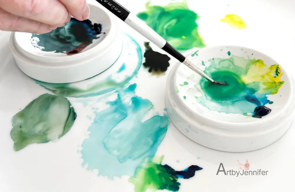
Now that we’ve covered the theory, it’s time to roll up our sleeves and dive into the fun part—actually mixing those greens!
This is where the magic happens, and I promise it’s far less daunting than it might seem. Whether you’re chasing the luminous glow of a fresh spring leaf or the moody depth of a shaded forest, the right color combinations are your secret weapon.
So, grab your palette and brushes, and let’s experiment with some tried-and-true mixes that will provide the perfect green for any subject.
I try to remember to start with yellow and then I add blue to my green mixtures.
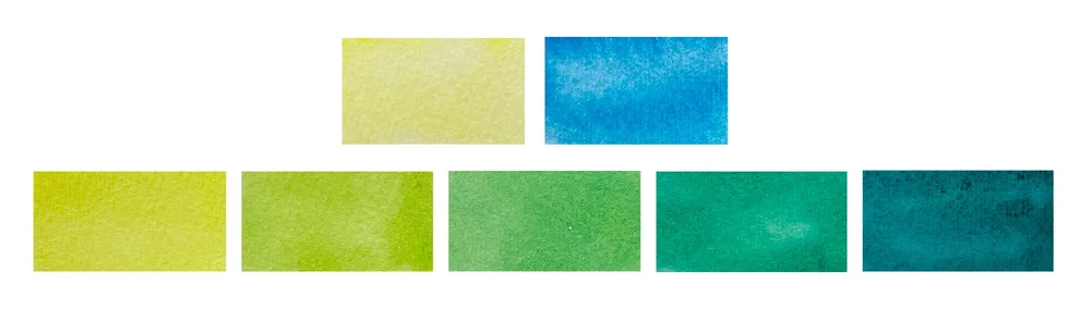
Creating Balanced Greens with Mid Yellows and Mid Blues
Mid yellows and mid blues are the unsung heroes of the palette. Because they sit in the neutral zone—leaning neither too warm nor too cool—they provide a rock-solid foundation for harmonious mixing.
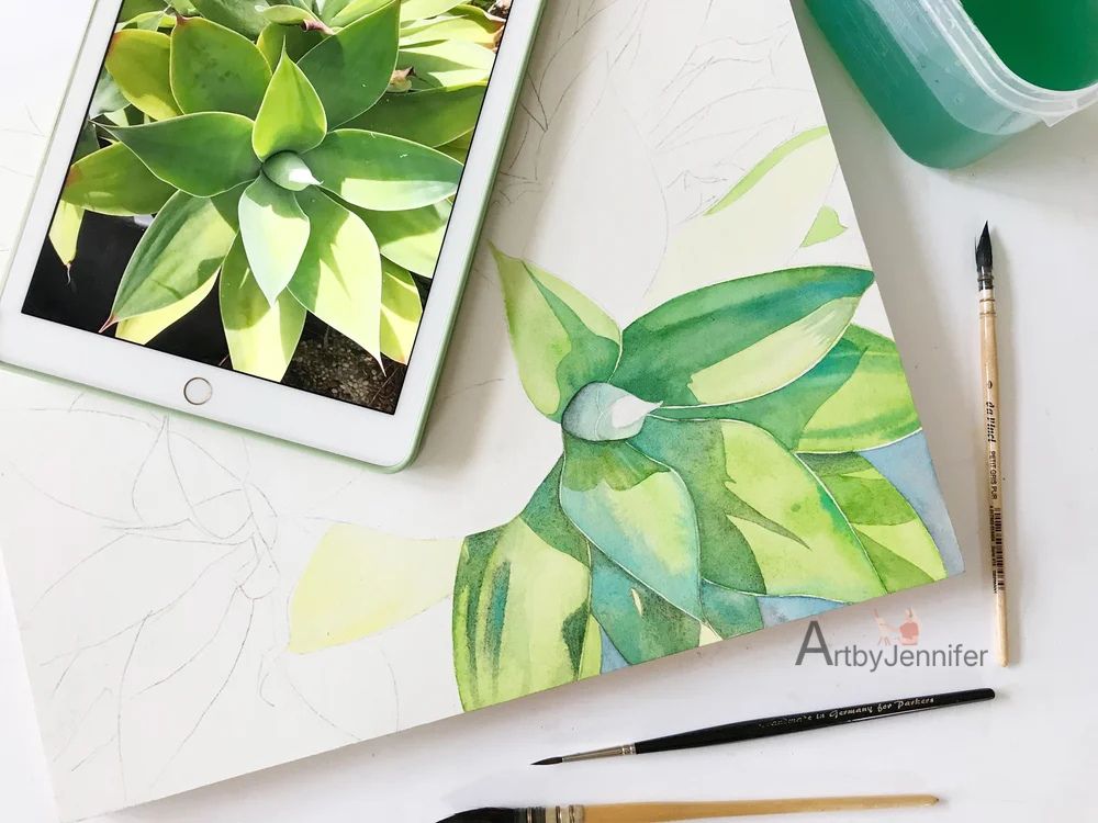
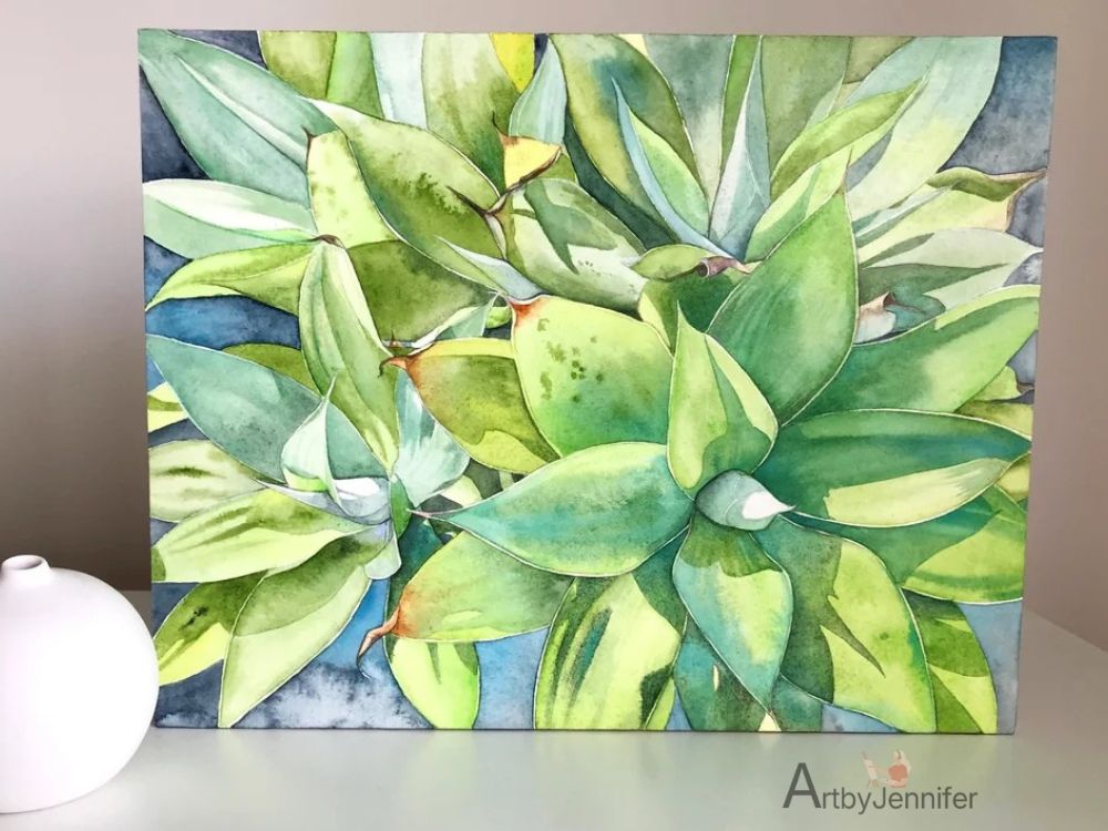
By pairing a mid yellow, such as Schmincke’s Pure Yellow (PY154), with a mid blue like Cobalt Blue (PB28), you can achieve greens that are remarkably natural and vibrant. These balanced mixes are incredibly versatile, making them perfectly suited for everything from the sprawling grass of a lush landscape to the intricate, delicate veins of botanical subjects.
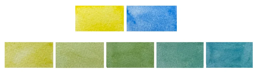
Greens mixed from Schmincke’s Pure Yellow and Cobalt Blue
How to Mix Bright Green
To achieve a bright, electric green, the rule of thumb is to mix two cool colors together. By combining a cool yellow with a cool blue, you eliminate any red undertones that might “muddy” the mix, resulting in a color that truly pops. You can easily tweak the ratio—adding more yellow for a sunny lime or more blue for a punchy teal—depending on your needs.
A Power Duo from Schmincke:
Try mixing Transparent Yellow (PY150) with Phthalo Blue (PB15):
Transparent Yellow: Although it has a subtle orange undertone, it is technically a cool yellow because it leans more toward green than red, providing a luminous, glowing base.
Phthalo Blue: This is a high-intensity pigment with a strong greenish bias. It’s the perfect partner for creating vibrant, high-energy greens that stand out on the page.
Schmincke’s Transparent Yellow and Phthalo Blue mixed together in varying ratios
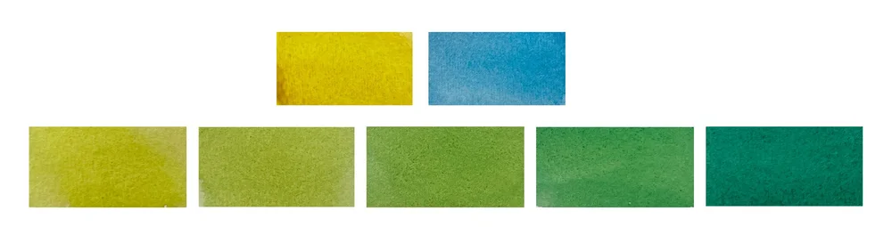
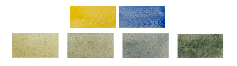
A Vibrant Alternative from Winsor & Newton:
For those who prefer the Winsor & Newton palette, try mixing Winsor Lemon (PY175) with Winsor Blue (Green Shade) (PB15):
Winsor Lemon: This is a bright, punchy yellow with a distinct cool bias. It acts as a clean, light-filled partner for cool blues.
Winsor Blue (Green Shade): As the name suggests, this is an intense blue that already leans heavily toward green. It has an incredibly high tinting strength, meaning a little goes a long way. Together, they create some of the clearest, most vibrant greens possible.
Winsor & Newton’s Winsor Lemon and Winsor Blue green shade mixed together in varying ratios
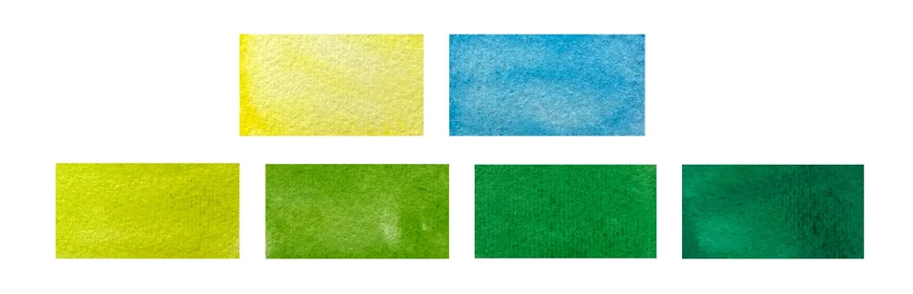
A Luminous Pair from Daniel Smith:
If you’re a fan of the Daniel Smith range, try mixing Hansa Yellow Light (PY97) with Phthalo Blue (Green Shade) (PB15:3):
Hansa Yellow Light: This pigment is celebrated for its bright, cool tone and high transparency. It’s the perfect “clean” yellow for building glowing, vibrant greens from the ground up.
Phthalo Blue (Green Shade): The cool undertones of this specific blue ensure your resulting greens stay lively and crisp. Because both colors lean toward green, the mix remains beautifully balanced without shifting too far into a warm or muddy territory.
Daniel Smith’s Hansa Yellow Light mixed with Phthalo Blue green shade in varying ratios.
How to Mix Less Saturated or Muted Greens
While vibrant greens are eye-catching, nature is often painted in much quieter tones. When you need a green that feels grounded and realistic—think of moss-clinging to damp rocks or the weary, sun-baked leaves of late summer—warm colors are your most important tool.
These earthy, muted greens possess a subtle, understated beauty. By intentionally lowering the saturation, you create a sense of depth and realism that prevents your landscape from looking like a cartoon. They are the “silent actors” that provide the perfect backdrop for your more vibrant focal points.
Schmincke’s Earthy Duo:
To create those rich, desaturated greens, try mixing Indian Yellow (PY110, PY154) with French Ultramarine Blue (PB29).
Indian Yellow: This is a warm, deep yellow that leans toward orange.
French Ultramarine: A classic warm blue with a distinct reddish undertone.
Because both of these pigments lean toward red (the complement of green), they naturally “fight” the vibrancy of the mix. The result is a beautiful, muted olive or mossy green. Don’t forget to vary the ratio: a touch more Indian Yellow will give you a golden, autumnal green, while more Ultramarine will push the mix toward a deep, moody shadow green.
Schmincke’s Indian Yellow mixed with French Ultramarine.
A Deep, Golden Duo from Winsor & Newton:
For a rich and grounded palette, try mixing Indian Yellow (PO62, PY139) with Winsor Blue (Red Shade) (PB15):
Winsor & Newton’s Indian Yellow: This is a deep, golden-yellow with a powerful warm undertone. Its distinctive earthy quality is perfect for injecting a sense of sun-drenched warmth and structural depth into your foliage.
Winsor Blue (Red Shade): Unlike its cooler “Green Shade” cousin, this is a deep, rich blue with a noticeable reddish undertone. Being slightly warmer than your typical Phthalo Blue, it provides a unique weight and warmth to the mixture.
When these two meet, they create sophisticated, less-saturated greens that feel heavy and organic—ideal for the darker, more mature parts of a garden or a forest floor.
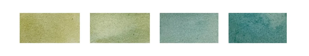
Winsor & Newton’s Indian Yellow and Winsor Blue red shade mixed together in varying ratios
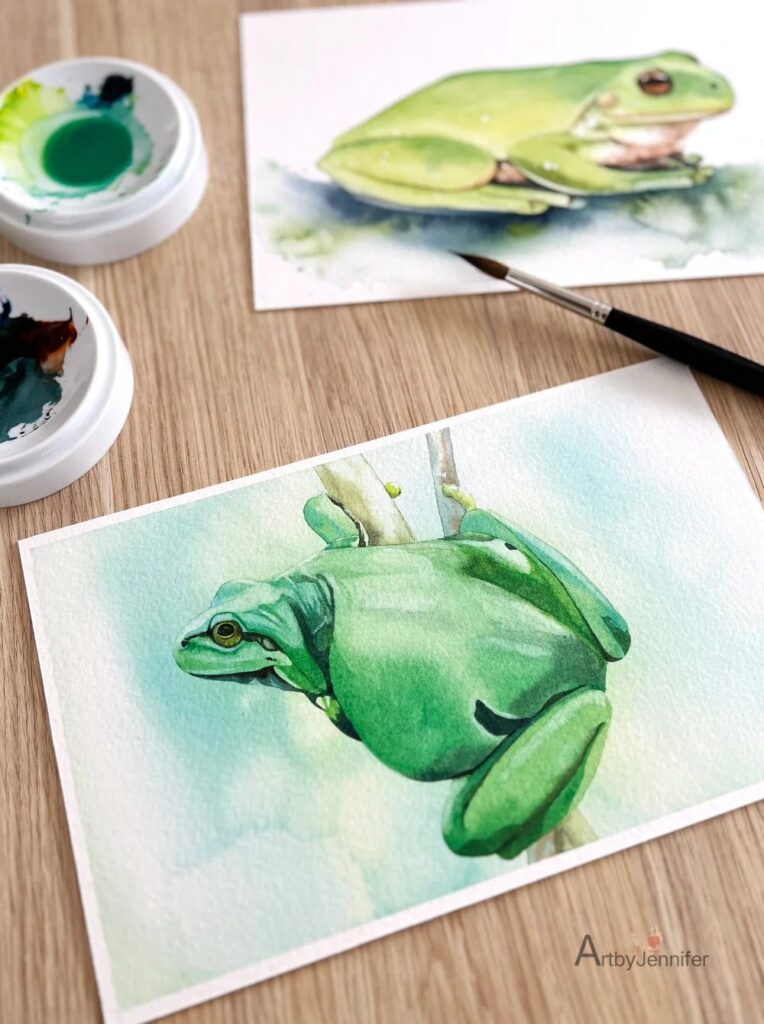
How to Mix Dark Green
When it comes to painting shadows or creating depth in foliage, mastering dark greens is essential. Achieving the right balance between richness and subtlety can transform a flat landscape into a dynamic, lifelike scene. Let’s explore the techniques and colour combinations that will help you mix those deep, moody greens with confidence:
Start with Deep, Dark Blues: To reach those heavy, low-value greens, reach for “powerhouse” blues like Prussian Blue (PB27), Indigo, or Payne’s Grey. Because these blues naturally sit much lower on the value scale, they instantly pull your yellow or green mixes into rich, shadowy territory.
Use Earth Tones: Sometimes, the secret to a dark green isn’t more blue—it’s an earth hue. Adding Burnt Sienna, Burnt Umber, or even Sepia to your green mixes deepens the color while introducing a natural, weathered quality that pure primary mixes can’t replicate.
The Ratio Shift (More Blue, Less Yellow): A simple way to darken a green is to skew your ratio. By increasing the blue and dialling back the yellow, you create cooler, darker greens that are perfect for the recessed areas of a forest or the underside of thick leaves.
The Power of Red: Adding a tiny amount of a complementary color, like Permanent Alizarin Crimson, will neutralize the green. This “kills” the vibrance and pushes the color toward a dark, moody shade. Be cautious, though—add too much and you’ll drift into brown or grey!
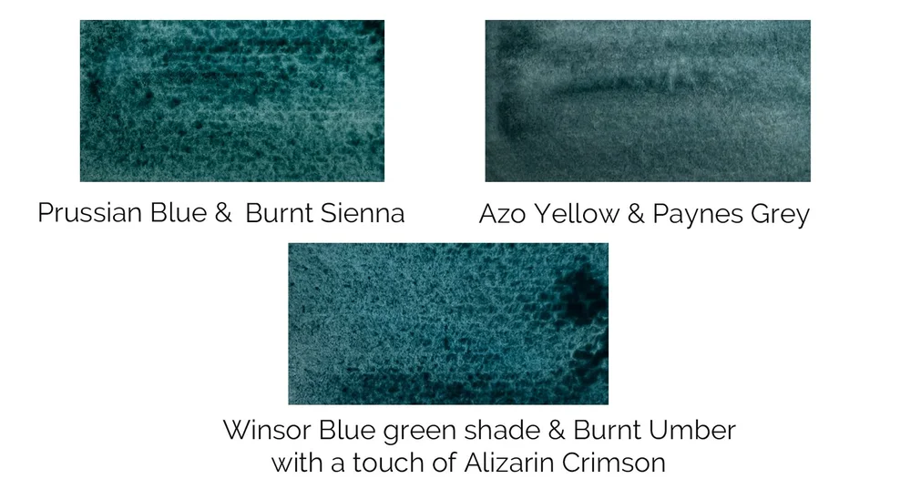
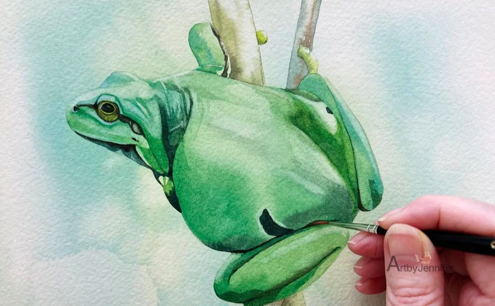
The darkest greens on this frog painting were mixed from Winsor & Newton’s Prussian Blue and Burnt Sienna.
Final Thoughts: Bringing Your Greens to Life
Mixing your own greens in watercolour may seem like a daunting challenge at first, but with practice, it becomes one of the most intuitive and rewarding parts of the creative process. By moving beyond the convenience of a tube and truly understanding hue bias, temperature, and pigment properties, you gain the power to create a spectrum of greens that bring genuine depth, vibrancy, and harmony to your work.
Remember: the key to mastering green is experimentation. Don’t be afraid to push your ratios, clash your temperatures, and always—always—take a moment to test your mixes on a scrap of paper before committing them to your masterpiece. With a little patience and a lot of play, you’ll soon find yourself mixing greens that don’t just “look like” grass or leaves, but perfectly capture the living beauty of the natural world.
Happy painting!