
For many beginners, reaching for a tube of black paint seems like the most logical way to create grey. However, using pre-mixed black can often lead to flat, ‘dead’ areas in a painting that lack the transparency and vibrancy that watercolour is famous for.
In this post, I’ll show you why mixing your own greys from the colours already on your palette is a game-changer. By combining complementary colours or using ‘primary’ mixes, you can create ‘living greys’—neutrals that possess a beautiful internal glow and harmonize perfectly with the rest of your piece. Let’s explore how to transform your work by mastering the art of the mixed neutral.
Basic Principles of Mixing Greys
Understanding Greys
Grey is far more than just a dull midpoint between black and white; it is a versatile, essential neutral that plays a crucial role in the harmony of a watercolour painting. By mixing complementary colours, you can produce intense, vibrant greys that possess a depth and variation impossible to achieve with a single tube of black.
The true magic of grey lies in its unique ability to bridge disparate colours and restore balance to a composition. To truly master this neutral, you must look beyond the surface and begin to recognise its temperature variations—the subtle shifts between warm and cool—and the specific mixing methods used to breathe life into different shades.
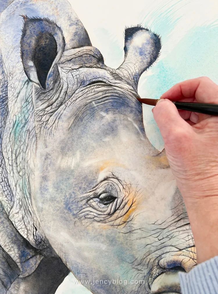
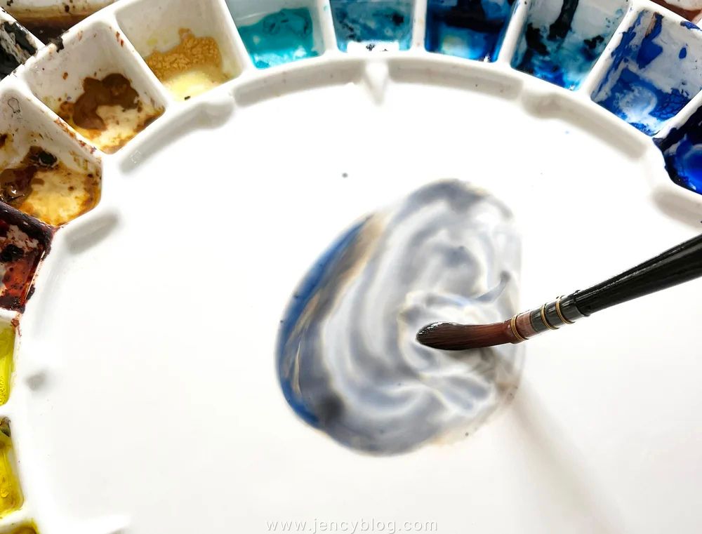
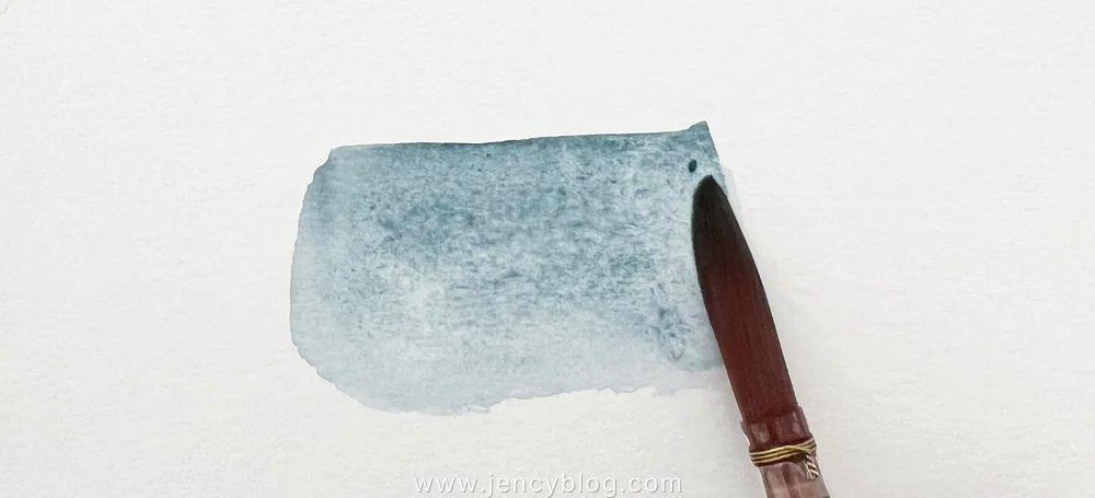
I used Burnt Sienna and Ultramarine Blue together to mix greys for this rhino painting.
Temperature of Greys
The temperature of a grey is its “soul.” Unlike a flat, neutral black, a mixed grey always leans toward a specific side of the color wheel. Understanding this distinction is crucial, as it directly influences the mood, atmosphere, and overall aesthetic of your artwork.
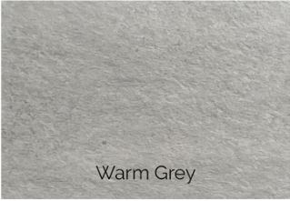
Warm Greys: These contain hints of red, orange, or yellow. They often create a sense of warmth, intimacy, and comfort—think of sun-baked stone, a sandy path, or the soft shadows on an animal’s fur.
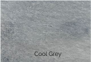
Cool Greys: These have undertones of blue, green, or purple. They evoke a sense of coolness, distance, or tranquility—ideal for misty mountains, shadows on snow, or a stormy morning sky.
When you mix your own greys, you gain total creative control. You can precisely adjust the temperature by selecting specific base colors and fine-tuning their ratios to suit the emotional weight of your painting.
Pro Tip: Temperature also helps create “depth.” Generally, cool greys appear to recede into the distance, while warm greys feel closer to the viewer.
Depth and Dimension
The temperature of your greys is a powerful tool for manipulating space. In art, color temperature dictates how a viewer perceives distance, and by mastering this, you can turn a flat piece of paper into a three-dimensional world.
Warm Greys Advance: Because they contain hints of red, orange, or yellow, warm greys tend to “pop” or move toward the viewer. These are perfect for foreground details, stones, or shadows in the immediate light.
Cool Greys Recede: With their blue or purple undertones, cool greys naturally pull away from the eye, receding into the background.
By strategically layering these temperatures, you can mimic atmospheric perspective. For instance, using warm greys for foreground elements and progressively shifting to cooler, lighter greys for distant objects creates the illusion of haze, fog, or vast distance. This simple shift in temperature tells the viewer exactly where each object sits in space.
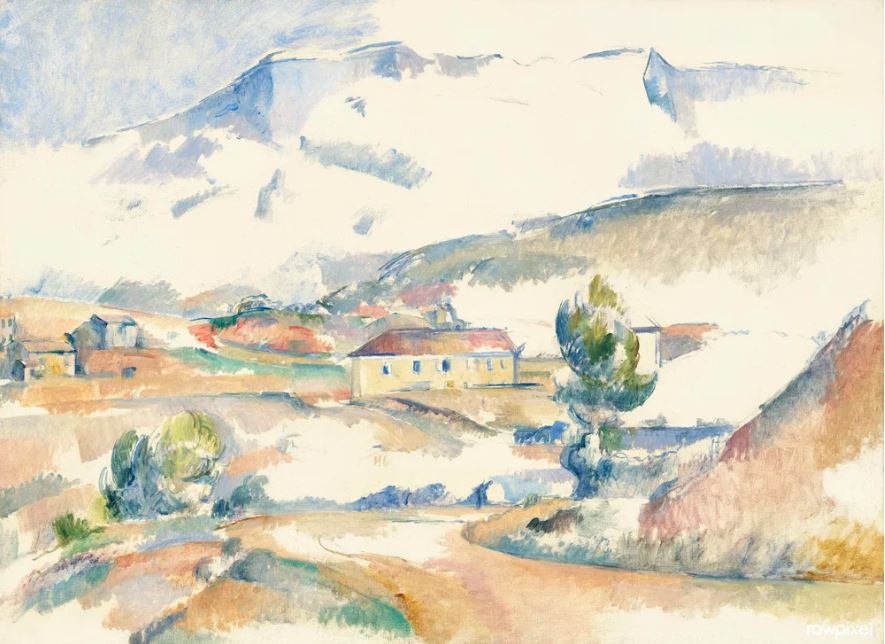
Cézanne’s Mont Sainte-Victoire (1887) – This masterpiece effectively demonstrates Cézanne’s use of cool greys for the mountain and warmer greys for the foreground trees and rocks. This strategic application makes the mountain appear distant while the foreground elements become more prominent. By doing so, he significantly enhances the painting’s spatial depth and guides the viewer’s eye through the landscape.
Harmonising Colour Schemes
Understanding the temperature of greys allows you to harmonise your colour schemes effectively. By selecting greys that complement the predominant hues in your paintings, you can achieve visual cohesion and balance. Warm greys can harmonise with warm, earthy tones, while cool greys can complement cool, watery blues or greens.
Greys can act as mediators between contrasting colours, softening harsh transitions and creating a sense of unity within the painting. This ability to bridge different colours and create harmonious relationships underscores the importance of greys in achieving visual balance and harmony.
Colours to Use for Mixing Greys
Mix Complementary Colours
Mixing complementary colours often results in a beautiful, balanced grey because the opposing pigments neutralise each other. This method is one of the most effective ways to create “living” neutrals that feel integrated into your painting.
Red and Green: Try mixing Permanent Alizarin Crimson (PR206) (a cool red) with Winsor Green (Blue Shade) (PG7) (a cool green) for a rich, neutral grey. Because these two sit opposite each other on the colour wheel, they effectively cancel out each other’s vibrancy. You can easily adjust the proportions to make the grey warmer by adding more red or cooler by adding more green.
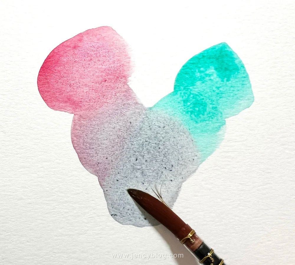
Permanent Alizarin Crimson PR206 (a cool red) mixed with Winsor Green blue shade PG7
Blue and Orange: Combine French Ultramarine (PB29) (a warm blue) with Burnt Sienna (PR101) (a warm orange-brown) to create a variety of warm to neutral greys. This is one of the most popular and versatile mixing pairs in watercolour, capable of producing everything from soft, misty sky greys to deep, granulating shadows.
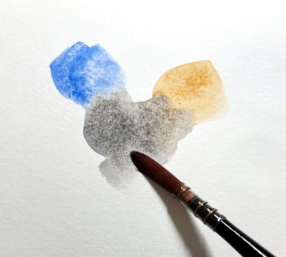
Ultramarine Blue PB29 with Burnt Sienna PR101
Yellow and Purple: Mix Winsor Yellow (PY154) with Winsor Violet (PV23) (a strong, cool purple) for a range of warm to cool greys. Because violet is the direct complement of yellow, these two will neutralise each other perfectly, allowing you to create everything from a delicate, sun-touched grey to a deep, moody shadow.
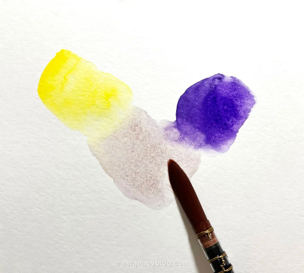
Winsor Yellow PY154 with Winsor Violet PV23
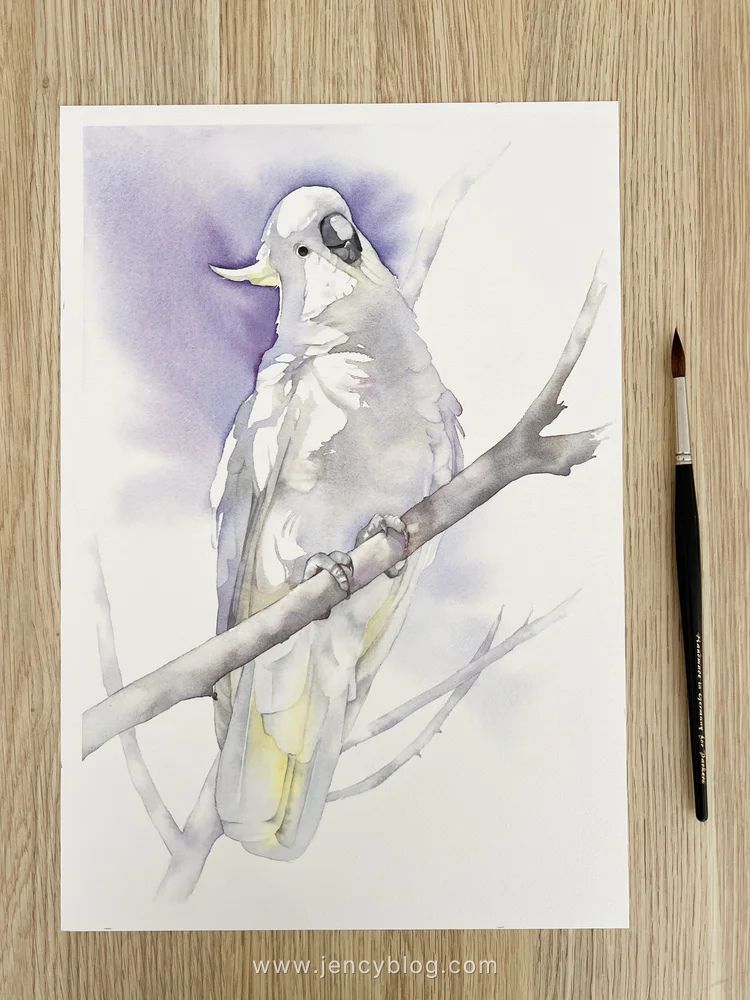
In my Cockatoo painting, I mixed two complementary colours to create the subtle greys: Schmincke’s Cobalt Blue Light (PB28) and Transparent Sienna (PR101).
The soft, airy greys in the feathers were achieved with a diluted version of this mix, while the dark grey on the beak was simply a more concentrated, darker mix of these same two pigments. Using the same colours throughout the bird ensures that the shadows feel natural and harmonised with the overall subject.
Earth Tones
Earth tones can also be mixed to create natural-looking greys that feel grounded and organic.
Burnt Umber (PBr7, PY42, PR101) and Ultramarine Blue (PB29): This combination produces a lovely neutral to cool grey. It is excellent for rendering shadow areas and natural scenes where you want the grey to feel integrated with the environment rather than synthetic.
Burnt Umber PBr7 – PY42 – PR101 and Ultramarine Blue PB29
Raw Sienna (PBr7, PY43) and Payne’s Grey (PBk6, PB15:6): Mixing these two creates a beautifully muted, complex grey. Because Raw Sienna is a natural earth yellow and Payne’s Grey is a deep, cool blue-black, the result is a sophisticated neutral that can be easily adjusted. Adding more Raw Sienna will lean the mix toward a warmer, golden grey, while more Payne’s Grey will push it toward a moody, slate-like cool grey.
Raw Sienna PBr7 PY43 and Payne’s Gray PBk6 PB15:6
Pre-mixed Colours
Pre-mixed grey watercolours are convenient and ensure consistency in your artwork. They save time and maintain uniformity across different pieces, making them ideal for beginners or fast-paced projects. However, they restrict creative flexibility and the ability to control subtle variations and undertones. Depending solely on pre-mixed greys can be problematic if a specific shade is discontinued or unavailable.
Personally, I prefer mixing my own greys to adjust their temperature. I enjoy the process of seeing individual colours separate on wet paper, creating unique effects that wouldn’t be possible with pre-mixed greys.
Neutral Tint
Winsor & Newton’s Neutral Tint is a versatile and essential colour in many artists’ palettes. It is designed to create a balanced, neutral grey that can be used to modify other colours or to create shadows without altering the hue of the original colours.
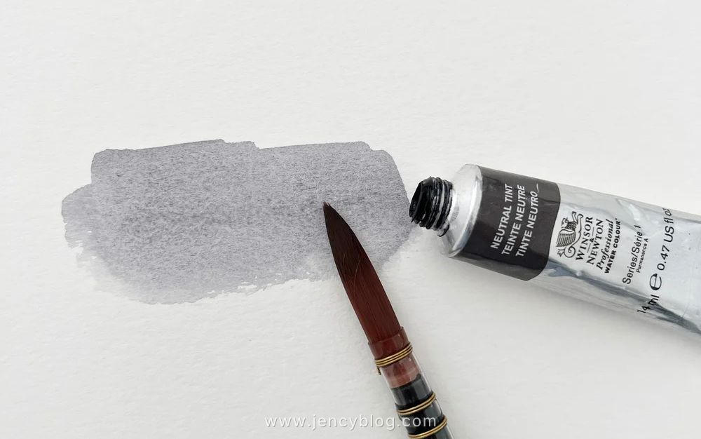
Neutral Tint – Start with small amounts when mixing with other colours. Gradually add more Neutral Tint to control the resulting shade.
Payne’s Grey
A popular choice for its rich, dark, and slightly cool hue. Payne’s Grey offers a more subtle alternative to black, enabling rich, deep shadows and atmospheric effects without overpowering other colours. Its excellent blending capabilities make it a staple in many artists’ palettes. When sourced from reputable brands, Payne’s Grey ensures consistent performance and colour stability.
Paynes Grey
I used Schmincke’s Paynes Grey to paint the background on this painting.
Davy’s Gray
Named after Henry Davy, a 19th-century artist famous for his landscapes and genre scenes, this color has remained a staple in artist palettes for centuries. It is a muted, neutral grey known for its earthy qualities and understated presence. Unlike more dominant greys, Davy’s Gray is characterized by its subtle, natural undertones, making it a sophisticated choice for building soft shadows or atmospheric layers in a painting.
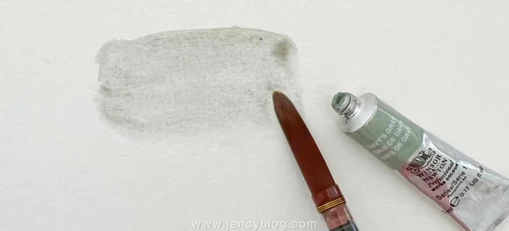
Davy’s Gray
Tips for Mixing Greys in Watercolour
Mixing Grey on a Palette
Start Light: Always begin with your lighter base pigment. Gradually darken the mixture by introducing small increments of the complementary color or other darker pigments to avoid overshooting your desired shade.
Maintain a Clean Palette: Ensure your mixing surface is spotless. A contaminated palette can quickly muddy your greys with unintended hues from previous mixes.
Mix in Small Quantities: Working with modest amounts of paint gives you better control over the final result and prevents unnecessary waste of expensive pigments.
Test on Scrap Paper: Never apply a new mix directly to your artwork. Always swatch it on a scrap piece of watercolor paper first to evaluate the true color and adjust the temperature if needed.
Document Your Success: Keep a small notebook to record the specific ratios and pigment combinations that create your favorite greys. This makes it much easier to replicate those perfect tones in future projects.
Layering Colours to Mix Grey on Dry Paper
Layering, also known as glazing, is a technique where you apply one colour, allow it to dry completely, and then brush a complementary colour directly over it. This method provides exceptional control over the final hue and the overall transparency of the grey.
By building the colour in stages, you create a visual depth that a single flat mix cannot achieve. In the example below, I first applied a delicate wash of Ultramarine Blue to the paper. Once that layer was bone-dry, I began washing Burnt Sienna over it. The two pigments interact optically on the paper, resulting in a sophisticated, luminous grey that maintains the clarity of the underlying washes.
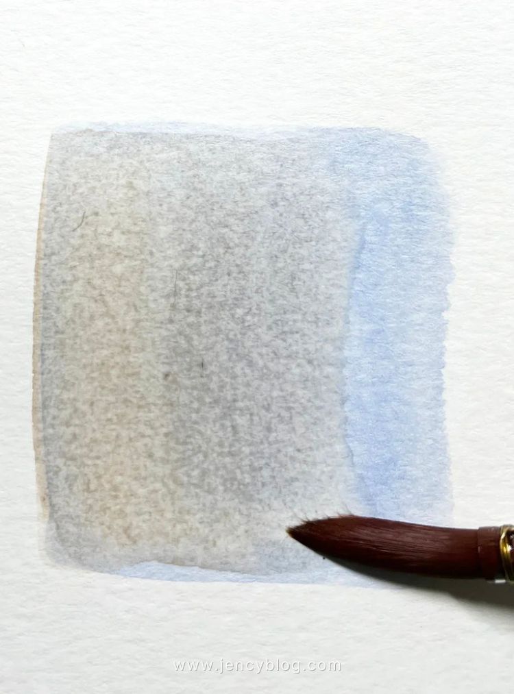
A dry wash of Ultramarine Blue is painted over with it’s complementary colour Burnt Sienna.
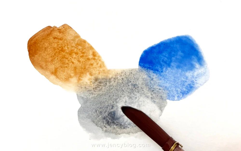
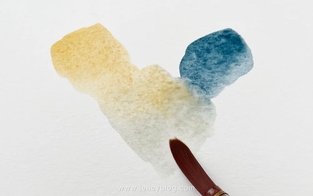
Blending Colours Wet on Wet
The wet-on-wet technique involves mixing your colours directly on the paper while the surface is still glistening. This approach is ideal for creating spontaneous blends and natural textures, lending a dynamic and fluid energy to your work.
Pre-Wet the Paper: Start by applying clean water to the specific area where you intend to mix. This ensures the pigments can move freely and blend with soft, seamless edges.
Apply the Base Colour: While the surface remains damp, lay down your initial base colour. Use a generous amount of water to maintain its fluidity and “open” time.
Introduce the Complementary Colour: Drop in your second colour while the base is still wet. Watch as the two pigments begin to mingle and neutralise one another right before your eyes.
Manipulate the Flow: You can guide the process by tilting your paper or using a soft brush to direct the pigments. This creates the kind of organic transitions and unique “accidents” that make watercolour so captivating.
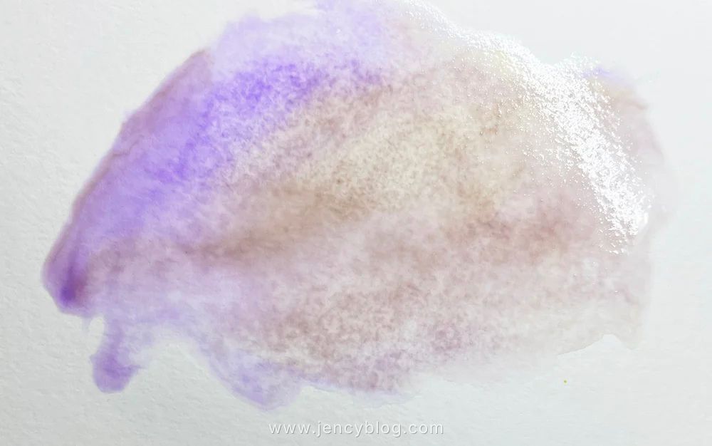
I wet the paper here and I applied a pale wash of Winsor Violet. While the violet was wet I painted on some Winsor Lemon. Then I lifted the paper and let the colours flow together.
Troubleshooting Tips for Mixing Greys
Even for experienced artists, achieving the perfect neutral can be tricky. Here is how to navigate the most common challenges:
The Issue: Muddy or Dull Colours
- The Cause: Residual pigments on your brush or a dirty palette are contaminating the mix.
- The Solution: Always start with a pristine mixing surface and clean water. To maintain vibrancy, avoid over-working the paint on the paper; the more you stir, the “flatter” the colour becomes.
The Issue: Inconsistent Tones
- The Cause: Re-mixing the same shade multiple times leads to slight variations.
- The Solution: For large areas, prepare a generous “puddle” of your grey on the palette beforehand to ensure uniformity. If layering, wait for the previous wash to be bone-dry to prevent the pigments from bleeding into an uneven mess.
The Issue: Unwanted Temperature Shifts
- The Cause: An imbalance in your complementary ratios.
- The Solution: Counteract the bias. If your grey feels too “hot” (red/orange), add a tiny touch of blue. If it feels too “chilly,” lean back into your warm tones. Always swatch on scrap paper to confirm the shift before painting your final piece.
The Issue: Incorrect Value (Too Dark or Light)
- The Solution: In watercolour, value is controlled by the water-to-pigment ratio. To lighten, dilute the mix with more water; to deepen the shadows, “charge” your brush with more concentrated pigment.
The Issue: Patchy or Uneven Washes
- The Solution: Ensure your paper is dampened evenly. Use a large, soft mop brush to lay down the wash in swift, continuous strokes, working quickly so the edges don’t dry before you finish the section.
The Issue: Overpowering Greys
- The Cause: The neutral is too opaque or dominant, masking the rest of the composition.
- The Solution: Apply the grey in thin, transparent glazes. By building the tone gradually, you allow the luminosity of the paper and the underlying colours to breathe through.
Conclusion
Mastering the art of mixing greys in watercolour is a journey that opens up a world of atmospheric possibilities. Whether you enjoy the surgical precision of mixing your own neutrals to control temperature or prefer the reliable consistency of pre-mixed tubes, each approach has its place in your creative toolkit.
By experimenting with Primary Triads, Complementary pairs, and techniques like glazing or wet-on-wet, you will discover that grey is far from boring—it is the secret to depth, harmony, and professional-level realism. Embrace these subtle shifts in tone to elevate your artwork to new heights.